

Versus Paint announces the Versus 2025 Colour of the Year
![]()
![]()
![]()
![]()

Versus Paint announces the Versus 2025 Colour of the Year: Dusty Pink, as seen on Gesels with Leandie du Randt on VIA TV
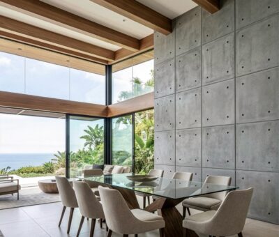
When it comes to creating interiors that exude both comfort and sophistication, few colours can compete with the understated elegance of dusty pink. This muted hue, enriched with subtle undertones of grey, has become a favourite in modern interior design. It’s no surprise that we’ve chosen it as our Colour of the Year.
Dusty pink’s appeal lies in its versatility. Unlike bold or bright shades, it offers warmth without overwhelming a space. The delicate balance of grey undertones ensures it remains a neutral option while adding just enough colour to make a statement. Whether you’re designing a minimalist sanctuary or a lavishly decorated room, this hue seamlessly fits into any aesthetic.
From cosy bedrooms to elegant living areas, dusty pink can transform spaces with its refined charm. As a primary wall colour, it creates a serene and inviting atmosphere. Used as an accent, it brings a touch of modern luxury to a room, pairing beautifully with metallics, whites, and natural textures like wood and linen.
![]()
![]()
![]()
![]()

Why Designers Love Dusty Pink
- Warmth and Elegance: The soft tones evoke feelings of comfort, making it ideal for intimate spaces.
- Versatility: Its muted nature means it works well with a wide range of palettes, from earthy neutrals to vibrant jewel tones.
- Modern Appeal: Dusty pink embodies contemporary trends while retaining timeless sophistication.
Tips for Incorporating Dusty Pink
- Accent Walls: Create a focal point in your room by painting one wall in dusty pink.
- Furniture and Accessories: Add subtle touches with dusty pink cushions, throws, or upholstered furniture.
- Layered Look: Pair dusty pink with shades of grey, cream, or gold for a layered and cohesive design.
A Colour for All Seasons
While often associated with spring and summer, dusty pink’s muted tones make it a year-round favourite. In colder months, combine it with darker hues like navy or charcoal for a cosy vibe. In warmer seasons, its soft warmth complements fresh whites and greens beautifully.
Bring the understated elegance of dusty pink into your home this year and see how this versatile colour can redefine your space.
Marketing Executive Tandi Potgieter chatted to Leandie du Randt on Gesels on VIA TV about the Versus Colour of the Year and the trends for 2025.
Versus Paint proudly sponsors Moves and Mimosas met Marika Opperman on Gesels, VIA TV. Watch every Saturday at 6pm.
![]()
![]()
![]()
![]()

Contact: Versus paint
Be more inspired here


You might also like...
-
Enhancing room acoustics with Scandinavian-style wooden acoustic panels

The atmosphere of a room is often shaped by its acoustics. Hard surfaces such as walls and ceilings can lead to echoes, making conversations less ...
-
Small Smokeless Fire Pits for Quiet Outdoor Moments | Helios Fire Pollux & Castor

At Helios Fire, they have always loved big moments around the fire — but this story is about small smokeless fire pits for quiet outdoor ...
-
Van Acht’s Expert Guide to Winter-Ready Doors and Windows

As temperatures begin to drop, preparing your home for winter becomes less about aesthetics and more about performance. Van Acht highlights how doors and windows, ...
-
Transform Walls into Statement Features with Float Concrete Panels

There are moments in design when a wall does more than enclose a room – it defines it. Float Concrete’s lightweight concrete panels offer ...


Visit SA Decor & Design on social media


