

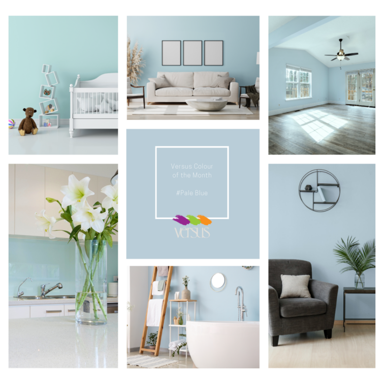
Versus Colour of the Month: Pale Blue
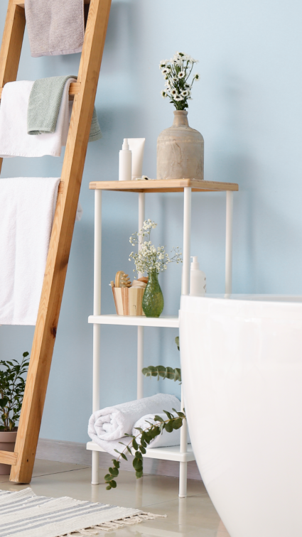
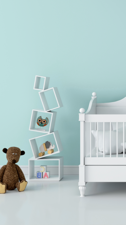
Immerse yourself in the tranquil serenity of Pale Blue, the Versus Colour of the Month. Like the gentle whisper of a breeze on a clear day, this soothing hue evokes a sense of calmness and tranquillity, inviting you to unwind and relax in your space. Be Inspired by this tone that will refresh your space, available from Versus Paint.
![]()
![]()
![]()
![]()
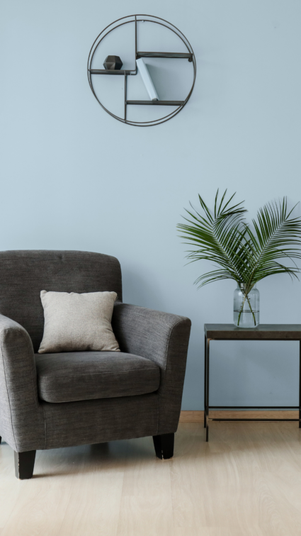
Transform any room into a peaceful sanctuary with Pale Blue. Its soft tones create an atmosphere of serenity and clarity, providing a refreshing escape from the hustle and bustle of everyday life.
![]()
![]()
![]()
![]()
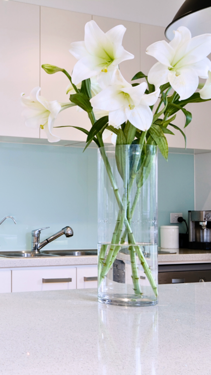
Experience the transformative power of colour as Pale Blue envelops your space, inspiring a sense of tranquillity and balance. Whether as a backdrop for a cosy living room or the perfect hue for a serene bedroom retreat, this colour adds a touch of peaceful elegance to any space.
![]()
![]()
![]()
![]()
Discover the full range of colours and order online at www.versuspaint.co.za. Also available at Versus Paint Direct in Wynberg and Leroy Merlin South Africa.
![]()
![]()
![]()
![]()
#VersusPaint #Paint #ColourTrends #HomeDecor #Blue #PaleBlue #Tranquillity #CalmingEffect
![]()
![]()
![]()
![]()
 You might also like.


You might also like...
-
A Comprehensive Guide To The Practical Benefits Of Useful Smart Panels

Smart technology is changing how we live every day. You can now control your lights and temperature with a tap. These updates make life easier ...
-
Quality Indoor Braais by Thermo Fires | Built-in & Freestanding

QUALITY INDOOR BRAAIS BY THERMO FIRES At Thermo Fires, you can find one of the most extensive ranges of locally manufactured indoor and outdoor braais. ...
-
Roco Fittings Unveils Its New Modern Website: A Streamlined Digital Experience for All Customers

Roco Fittings is proud to announce the launch of its brand-new website — a modern, streamlined, and customer-centric platform designed to elevate the way customers ...
-
Max on Top: History Meets Modern Charm with Homapal Metal Laminates

HISTORY MEETS MODERN CHARM As a South African distributor of Homapal real metal laminates, Max on Top gives architects, designers and fabricators access to internationally ...


Visit SA Decor & Design on social media


