

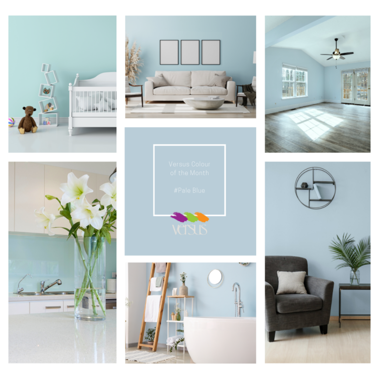
Versus Colour of the Month: Pale Blue
Immerse yourself in the tranquil serenity of Pale Blue, the Versus Colour of the Month. Like the gentle whisper of a breeze on a clear day, this soothing hue evokes a sense of calmness and tranquillity, inviting you to unwind and relax in your space. Be Inspired by this tone that will refresh your space, available from Versus Paint.
![]()
![]()
![]()
![]()
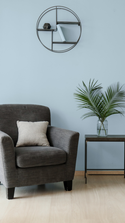
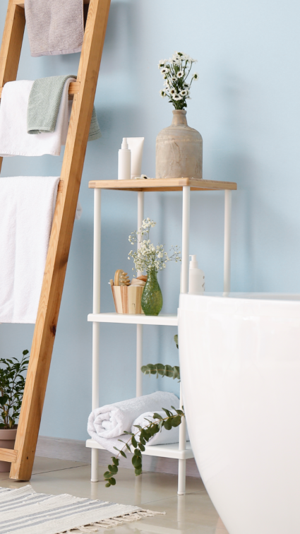
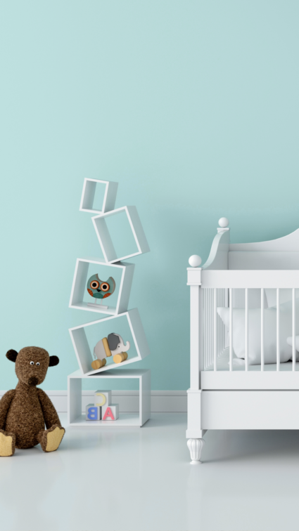
Transform any room into a peaceful sanctuary with Pale Blue. Its soft tones create an atmosphere of serenity and clarity, providing a refreshing escape from the hustle and bustle of everyday life.
![]()
![]()
![]()
![]()
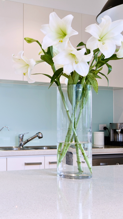
Experience the transformative power of colour as Pale Blue envelops your space, inspiring a sense of tranquillity and balance. Whether as a backdrop for a cosy living room or the perfect hue for a serene bedroom retreat, this colour adds a touch of peaceful elegance to any space.
![]()
![]()
![]()
![]()
Discover the full range of colours and order online at www.versuspaint.co.za. Also available at Versus Paint Direct in Wynberg and Leroy Merlin South Africa.
![]()
![]()
![]()
![]()
#VersusPaint #Paint #ColourTrends #HomeDecor #Blue #PaleBlue #Tranquillity #CalmingEffect
![]()
![]()
![]()
![]()
 You might also like.


You might also like...
-
Fire, Food and Focus: Designing Outdoor Spaces That Invite You In

In Gauteng, we know how to “kuier”. Someone lights the fire, the kids disappear into the garden, and before long, there’s an argument over who ...
-
Beat the Heat in Style This Summer with Solent Ceiling Fans

When the South African summer rolls in and the mercury climbs, the need for a cooling solution that blends comfort with style becomes all too ...
-
Sculpted Elegance: The Quiet Power of Luxury Door Hardware

THE ART OF THE HANDLE Where Craftsmanship Becomes the First Gesture of Luxury There is a moment, just before entering a space, when the hand ...
-
Trend Sparks for Summer 2026: Designing with Texture, Flow & Soul – The Woodcentre Perspective

As we move into Summer 2026, interior design is shifting toward spaces that feel grounded, tactile, and emotionally connected. The season ahead celebrates natural textures, ...


Visit SA Decor & Design on social media


