


Revelation – Versus Colour of The Month
We are welcoming June in with a revitalizing blueish grey hue called #Revelation from Versus Paints.
Revelation is a cool grey with a blue undertone. It is an invigorating colour that reminds us of the morning mist rolling over distant mountains.


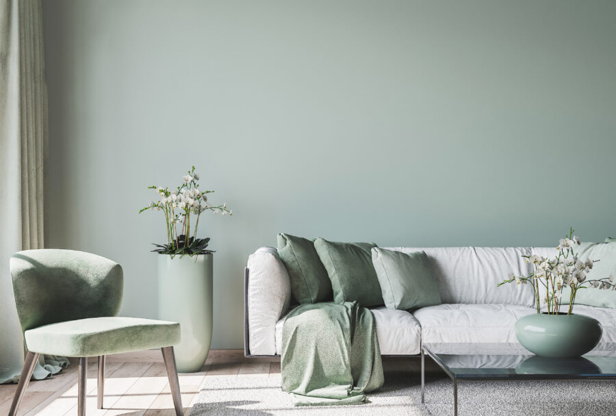
The beauty of Revelation is that it is just as versatile as standard neutrals. This subsequently means that it can work in just about any indoor space.
Furthermore, this cool hue works wonders in the bedroom to set a calming and relaxing atmosphere. This is especially true if you are one who is easily overstimulated by brighter colours.


Combining a feature wall in Schooner or Mosaic with accent walls in Revelation is also the perfect choice for the dining room and kitchen as blue is known to stimulate the appetite.
Things we love about #Revelation:
- It’s a soulful colour that anchors any space.
- A beautifully serene colour – for a calm ambience.
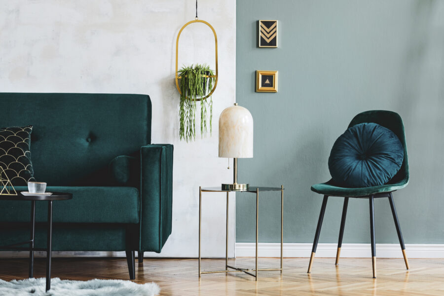
- Versatile – pair with mixed textures like metals and wood for a refreshing feel.
Feeling inspired? Get Revelation online from www.versuslifestyle.com


Remember, all Versus paints are also available from Versus Paint Direct Wynberg and Leroy Merlin South Africa.
#VersusPaint #Paint #ColourTrends #HomeDecor #ImagineWhatWeCanDoForYou #ItsALifestyle #PaintTrends #HomeDecor #HomeInspo #HomeGoals


You might also like...
-
Roco Fittings: Stylish Glass Door Solutions for Modern Homes

Glass doors have become one of the defining features of modern interior design, adding both style and functionality to kitchens, wardrobes and living spaces. Roco ...
-
Emerging Trends: Stylish & Functional Decorative Rails by Press Up Industries

Press Up Industries continues to demonstrate that practical design and beautiful interiors can go hand in hand with the introduction of its latest collection of ...
-
Butter + Sky: A Radiant World of Light and Optimism

The optimistic Butter + Sky “world” from Plascon’s 2026 Colour Forecast offers a breath of lightness designed to lift the mood. Expansive, uplifting and radiant, ...
-
Colours of Home: Bringing Personal Spaces to Life with Confidence

Your home is more than just a structure. It reflects who you are, how you live, and the moments that matter most. With the ...


Visit SA Decor & Design on social media


