

Butter + Sky: A Radiant World of Light and Optimism

The optimistic Butter + Sky “world” from Plascon’s 2026 Colour Forecast offers a breath of lightness designed to lift the mood. Expansive, uplifting and radiant, it celebrates light in all its forms, presenting a palette that draws inspiration from clear blue skies, golden blooms and sun-warmed walls. The result is a collection that invites serenity while inspiring optimism—airy, joyful and grounded in simple beauty.
As one of four distinct colour worlds within Plascon’s ‘HAND, made’ themed Colour Forecast for 2026, Butter + Sky sits alongside Land + Sea, Fashion + Candy, and Orchard + Blooms. Together, these worlds explore colour as a reflection of human touch, individuality and craftsmanship. Within this broader narrative, Butter + Sky focuses specifically on the art of light—how colour can transform a space through warmth, reflection and gentle contrast.
“In a world that often feels complex, Butter + Sky returns us to a sense of ease,” says Leslie Frank, Head of Marketing at Plascon. “These hues remind us that comfort can be found in simplicity, in sunlight and in the quiet joy of bringing colour to life by hand.”
Inspired by blue horizons and the golden tones of nature, the Butter + Sky palette blends radiant yellows with grounded neutrals and crisp, refreshing blues. Together, these tones create an optimistic story that balances energy with calm.
![]()
![]()
![]()
![]()

Blazing Sun (Y4-A1-4) introduces the brightness of midday into interiors, infusing spaces with warmth and vitality. Julia (Y3-A2-2) softens this energy with a buttery glow, offering comfort while maintaining a contemporary edge. In contrast, Sapphire (B7-A1-1) and Athena’s Dream (B4-A2-1) evoke open skies and fresh air, bringing clarity, depth and a sense of openness to interior schemes.
To ground these lighter tones, Cave Painting (O2-C1-1) and Chocolate Chunk (O2-D1-1) introduce richness and tactility, reminiscent of handcrafted pottery and sunbaked clay. Meanwhile, a vibrant touch of Signal Red (G7) adds an expressive accent, encouraging individuality and reflecting the creative spirit at the heart of the HAND, made theme.
![]()
![]()
![]()
![]()

Together, these hues form interiors that feel both calm and uplifting, breathing optimism into everyday spaces. Whether layered in tonal harmony or used as bold contrasts, Butter + Sky captures a sense of renewal—reminding us that colour, much like light, has the power to elevate how we live and feel.
The pre-existing Plascon colours within this world have been carefully curated to reflect the spirit of the times. Each shade can be tinted in a chosen Plascon coating type at leading retailers, allowing for personal interpretation and expression through the HAND, made story.
For more information, visit www.plasconcolour.co.za Stockist Plascon Visit dulife
![]()
![]()
![]()
![]()


You might also like...
-
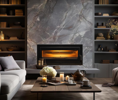
Built-In Fireplace Design for a Calm Home Sanctuary with Hydrofires

In today’s fast-paced world, the idea of home as a sanctuary has never been more important. Homeowners are increasingly designing spaces that promote calm, comfort, ...
-
The Versatility of Barrel Bolts: Custom Fastening Solutions from Press Up Industries

When it comes to secure and reliable fastening solutions, Press Up barrel bolts remain among the most practical and versatile hardware components available. At Press ...
-
Lighting as Architecture: How Integrated Systems Are Transforming Modern Interiors

Light, when fully integrated, becomes less an addition and more a defining layer of space, shaping how interiors are experienced, navigated, and understood. Within ...
-
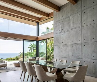
Transform Walls into Statement Features with Float Concrete Panels

There are moments in design when a wall does more than enclose a room – it defines it. Float Concrete’s lightweight concrete panels offer ...


Visit SA Decor & Design on social media


