

Colour Crush With Paintsmiths
No matter the ambience, mood or style of your space, the right colour palette can take it to a whole new level. If energy and vibrancy are what you’re aiming for, you need to get creative and embrace colour. If the goal is a calm or serene space, the same is true. The right colours are one step away… Find the perfect dynamic tones for your space with our Color Crush with Paintsmiths.
![]()
![]()
![]()
![]()
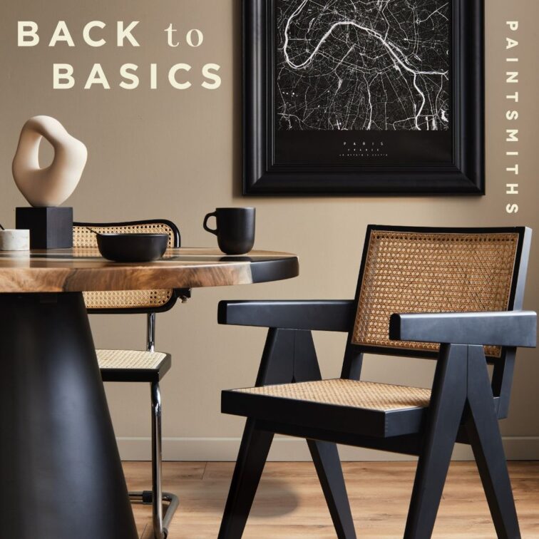
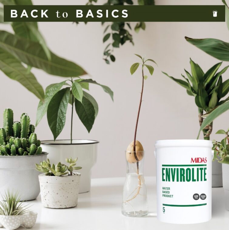
Back to Basics
Basic doesn’t mean boring. In fact, there are so many different shades of neutrals that it may make your head spin. Basic tones set the stage for simple, sleek and chic interiors. So if you’re after a calm yet contemporary look at home, go for the basic. You won’t go wrong!
Neutrals also enhance an organic and sustainable design scheme. This year, sustainability is a hot trend and we can see why! The most important reason for deciding to live sustainably is to simply safeguard the environment. It means ensuring its stability and existence for future generations. Start with the basics, like partnering with a paint family that shares your vision. Paintsmiths will go the extra mile.
![]()
![]()
![]()
![]()
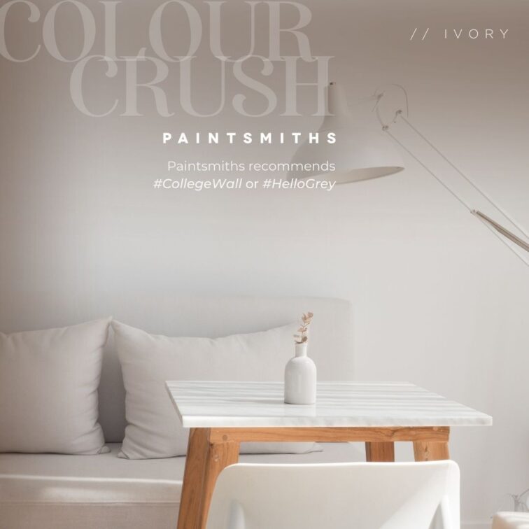
Ivory and White
White is not just the mere absence of colour, it goes much deeper and wider than that. White is… as fierce as red and as definite as black. In fact, if you love pure white, white-on-white or just kinda white, then try Paintsmiths’ ‘CollegeWall’ or ‘HelloGrey’.
Ivory is another gorgeous option. It is elegant and easy to complement with many other colours. Ivory is softer than cream, warmer than bone, and a touch darker than eggshell. It’s the kind of colour that adds warmth and elegance to your home in equal measure. And since it’s not quite as obvious as white, it’s a pretty fun neutral to play with.
![]()
![]()
![]()
![]()
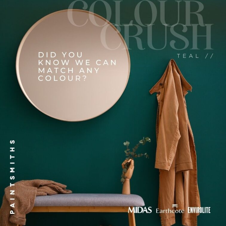
Bright Shades
A soulmate is the one who makes you come to life. In the same way that a person can spark passion, so too can colour in the home, just like dark greens and burnt orange. Paintsmith has several greens in the Midas and Earthcote Product ranges to choose from, and if you need something as unique as your fingerprint…well, then they can colour match that too! Try Paintsmiths ‘Unite’ if you like burnt orange hues. They are warm, rich and hospitable.
![]()
![]()
![]()
![]()
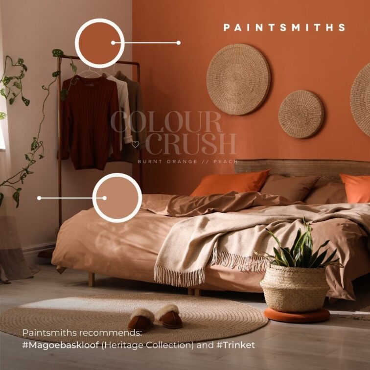
Rustic Tones and Burnt orange
Softly the evening came with the sunset and oh the colours the sunset sky has to offer! Orange can make a striking addition to any space giving it a formal look —especially if you have the right colour to pair it with. Lighter orange shades of apricot or peach work beautifully in bedrooms and living spaces. It also adds to a rustic and unrefined interior.
![]()
![]()
![]()
![]()
Go green
Going green is more than just choosing a colour in the greenery family. Being ‘green’ is something that goes right to your core. Furthermore, being green is not an accomplishment anymore either. It is a requirement. Paintsmiths believes in a lifestyle that speaks of clean living. They share advice for you today, to start with the basics. Part of the basics is to look at your water, your home and your energy. Choose walls that breathe life into your home on your ‘green’ journey.
![]()
![]()
![]()
![]()
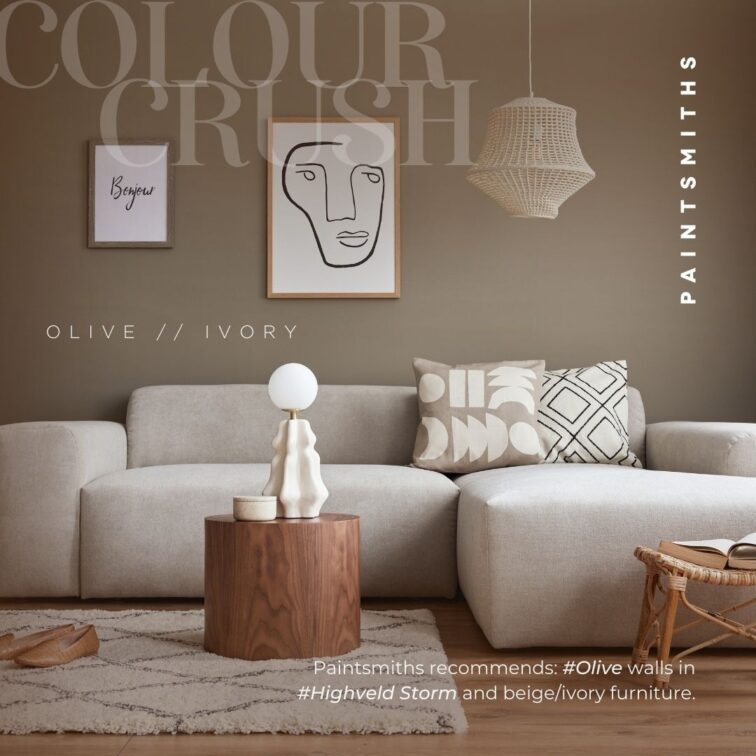
Olive and Ivory
Love isn’t butterflies all the time. Perhaps it can also be said that love is calm, just like this picture below. Love is comfortable and you could sit in silence for the rest of your life and that might mean more than a thousand words. Olive and Ivory have just that with each other, don’t you think? Olive green is on-trend – and it appears it will be one of the topmost stylish colours for the next few years. It varies greatly in hue and saturation from cool to warm tones, giving you plenty of flexibility when decorating with olive green. Also known as cargo, sage and even chartreuse, this colour is quite versatile. It’s the perfect shade to add to your living space!
![]()
![]()
![]()
![]()
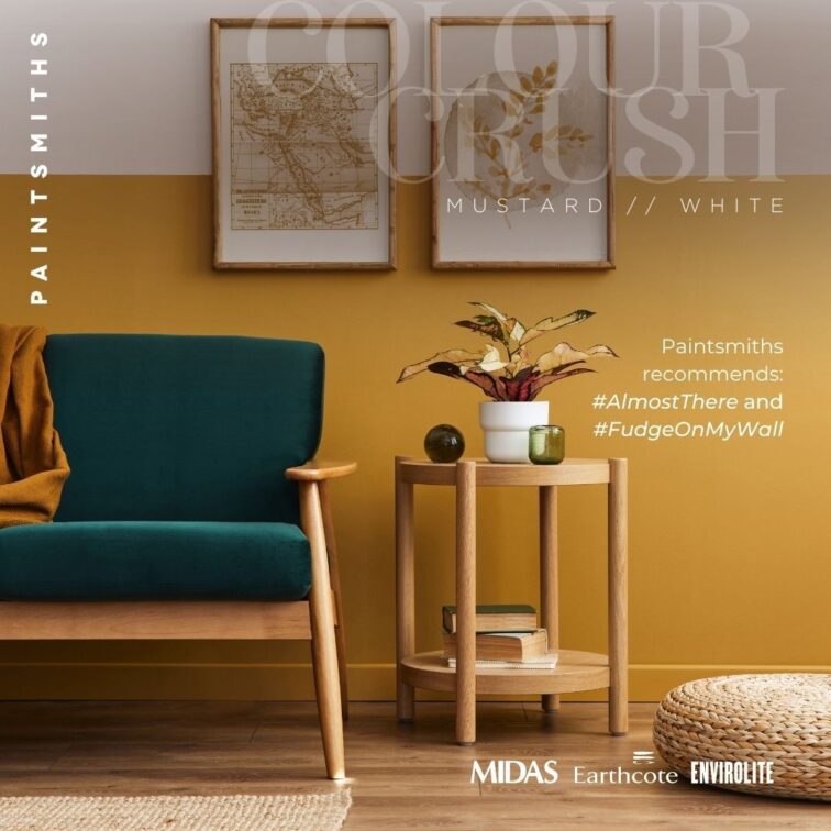
Fudge on My Wall
With a name like ‘Fudge on my wall’ you have to know that this colour is quite the playful tone. It’s in the mustard family — a warm, zingy shade—with gorgeous undertones that can feel both earthy and subdued or bold and inviting. While many shy away from shades of yellow in their homes, a smart use of mustard can create a distinctive, revitalized aesthetic.
![]()
![]()
![]()
![]()
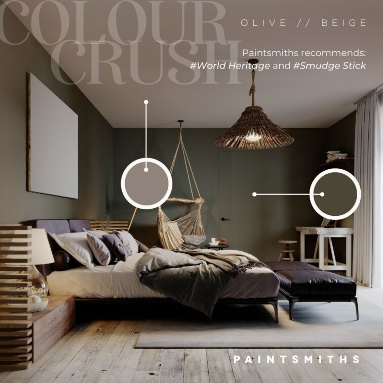
A world of Beige
Back in the day, beige was seen as basic and uninteresting. But no longer. Depending on what you pair this versatile neutral with, it can be a showstopper in your interior. With olive, it’s a warm, organic and rich colour palette that invites rest and invigoration.
With its rich, muddy undertones, olive can command a room but it is equally content to play a supporting role for cheerful pastels, jewel tones and both dark and light woods. A verdant shade of olive on the walls can thus create a sophisticated backdrop for those basic shades of beige.
![]()
![]()
![]()
![]()
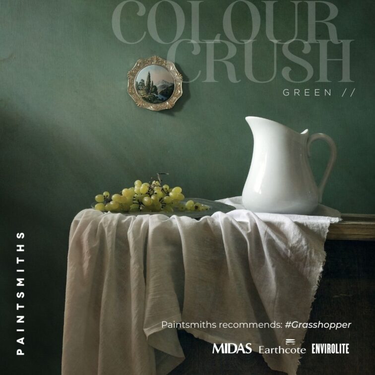
Greenery Galore
Greens can create a peaceful, relaxed setting and feel either warm or cool depending on the undertones. They are very versatile and can be used in any space both interior and exterior. Greens can furthermore be deep and dark, as well as bright and lively and can be combined with other hues to produce teals, citrus shades or lime. Perfect for a nursery or bedroom, fresh greens resembling plants and nature create a calm and inviting space and reflect beautifully in streaming daylight.
![]()
![]()
![]()
![]()
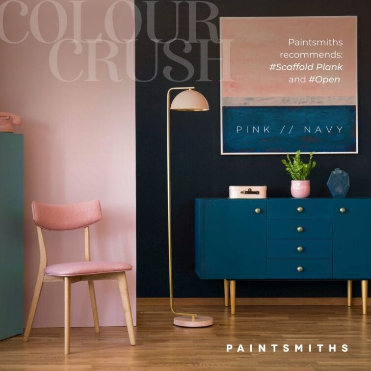
Pink and Navy
Navy is certainly a moody tone, but when paired with pink, it makes for a delightful combination. Navy gives pink a certain solemnity, and pink keeps navy from being too boring and dour. They’re an ideal couple, two partners who bring out the best in each other.
No matter your preferred colour choice, Paintsmiths can help you achieve the perfect colour combinations. Be sure to get in touch so the team can help you bring your visions to life.
For more visit Paintsmiths.


You might also like...
-
Van Acht’s Expert Guide to Winter-Ready Doors and Windows

As temperatures begin to drop, preparing your home for winter becomes less about aesthetics and more about performance. Van Acht highlights how doors and windows, ...
-
Quality Indoor Braais by Thermo Fires | Built-in & Freestanding

QUALITY INDOOR BRAAIS BY THERMO FIRES At Thermo Fires, you can find one of the most extensive ranges of locally manufactured indoor and outdoor braais. ...
-
The Essential Door Hardware Checklist for Modern Student Accommodation | Insights from Ironmongery Warehouse

In the evolving landscape of student accommodation, design is no longer confined to aesthetics alone. Increasingly, it is the unseen details—the tactile, functional elements—that ...
-
Styling with V-Groove & Oak Acoustic Panels | Inspiration Wood Interior Design Trends

In an era where interiors are expected to do more than simply look good, Inspiration Wood positions itself at the intersection of design intelligence and ...


Visit SA Decor & Design on social media


