

Plascon Colours: A Forecast for 2018
Colour influences every aspect of our lives – from fashion and décor to art and design. Every year, Kansai Plascon publishes their viewpoint on the latest colour trends in their Colour Forecast. We bring you a closer look at the Forecast for 2018 – in a celebration of colour trends that are pure genius!
It starts with the experts in the brand’s Colour Team surveying the way colour is being used across the creative industries, and then filtering this insight into a set of trend stories that truly reflect the global mood. These curate a palette of colours from the Kansai Plascon colour system, brought to life through inspiring room sets and inspirational imagery. With this approach customers can get an insight into the trends at play, supported by the guidance to bringing the looks to life in their own spaces. ![]()
![]()
![]()
![]()
 What can we expect for 2018? Current colour trends are seeing an experimental spirit in design coming through. Seemingly unusual colour combinations are being brought together, and while not what would be considered a typical colour combination, when you see them together they really do work. This year, the Plascon Colour Forecast Team reiterate that when bold colour choices are on trend, the Forecast is even more important to give customers confidence to explore these in their own homes.
 ![]()
![]()
![]()
![]()
 Here are the colour stories:
Colour Story One: Exotic Euphoria In this first theme, the distinction between natural and artificial blurs in response to scientists and artists hybridising the two in their work. The palette’s supercharged and jungle-inspired brights are almost phosphorescent, especially against the backdrop of lush natural hues. The overall feeling is a little wild and overgrown, and it’s perfect to create living spaces that feel connected and natural but energetic at the same time.
Colour Story Two: Soft Composition Soft Composition is about editing spaces and styles to create room for contemplation. The mood is calming yet grounded and the whole look is inspired by classic form and colours. The palette gets its on-trend update through the inclusion of bold retro accents alongside the muted colours. In this way, classic and contemporary are combined. The whole idea is to create spaces that feel familiar but at the same time look new. It’s a warm take on minimalism for the way we live today. ![]()
![]()
![]()
![]()
 Colour Story Three: Craft Spirit Every culture has a craft heritage and this theme is inspired by the way this common past connects us all today. It’s about combining North and South, East and West, and finding that the ties that bind are invariably colour. This rich global mix is expressed in a palette of pigmented hues, fruity accents and watery blues. The overall feeling created in Craft Spirit is one of connection and it’s ideal for creating rich and textured living spaces.
Colour Story Four: Hi-Glo One for the adventurous, Hi-Glo is the mash-up of digital and physical. It’s inspired by how the digital space allows people to express new identities and at the same time how colour still has such a physical presence in our lives. It’s a rule-breaking palette of citrusy sorbet tones, soft pink, mid-toned primaries and grounding earthy colours to hold it all together. It’s the perfect way to create youthful and more experimental spaces, and lends itself well to artistic colour treatments and paint effects. ![]()
![]()
![]()
![]()
 Contact: Plascon


You might also like...
-
Neuroaesthetic Design by Black Pearl Interiors: Spaces That Soothe the Mind and Elevate Wellbeing

Interior design is no longer simply about aesthetics — it’s about how a space makes people feel. At Black Pearl Interiors, the team embraces the ...
-
THE BOHOHO – May we introduce Maximalism at its finest

An exceptional property in an even more exceptional location, the BOHOHO in Bakoven, Cape Town, celebrates the nostalgic charm of the 1960s with contemporary flair. ...
-
Dulux: Easy DIY Décor Tips to Refresh Your Home

Updating your home’s look doesn’t have to be expensive or time consuming. With a few simple décor tricks and the right colour choices, you can ...
-
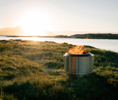
Celebrate the Warmth of Freedom and Festivity with Apollo, the Smokeless Firepit

April is all about meaningful moments — the kind we share around a table, on the patio, or under open skies. With Easter and Freedom ...


Visit SA Decor & Design on social media


