

Versus Paint: Keep it Serene with The August Colour of the Month
As we celebrate women this August, let’s keep things sophisticated and Serene with the August colour of the month from Versus Paint!
Versus Luxury Paint & Coatings are celebrating women this Women’s Month at the MotherKind Women’s Wellness Day event on 23 August. Guests will get an opportunity to be photographed in their iconic Versus Luxury Paint Tin Photobooth that went viral at the SA Style Awards earlier this year.
This women’s month, the theme is serenity. The Versus Luxury Paint colour for the month of August is Serene. Serene is a sophisticated blend of grey and beige. Its unique neutrality provides the warmth of beige with the cool sophistication of grey, making it an adaptable base or accent for nearly any style of home. Whether you’re renovating a single room or designing an entire home, Serene offers the perfect foundation for a refined and calming aesthetic.
![]()
![]()
![]()
![]()

One of the primary strengths of Serene is its versatility. It works beautifully across different lighting conditions, often appearing warmer in natural sunlight and cooler under artificial light. This makes it especially suitable for open-plan living areas, where consistent wall colour can unify kitchen, dining, and lounge spaces while still responding subtly to light throughout the day.
In living rooms, Serene offers a neutral backdrop that complements a variety of textures and materials. Pairing Serene walls with natural finishes like wood, stone, and linen can create an organic, serene space. For a more contemporary look, Serene also works well with black accents, metallic finishes, and glass elements, providing contrast without overwhelming the space.
![]()
![]()
![]()
![]()
 Bedrooms benefit from Serene’s calming influence. As a wall colour, it promotes restfulness while providing more depth than standard whites or creams. Soft furnishings in muted blues, sage greens, or dusty pinks harmonise beautifully with Serene, helping to create a layered and inviting atmosphere.
Serene also excels in transitional spaces such as hallways and entryways. Its understated elegance allows for flexibility in artwork, furniture, and decorative accessories, which can be easily updated without the need to repaint. It also serves as a perfect backdrop for bold lighting or statement mirrors, enhancing the sense of space and light.
![]()
![]()
![]()
![]()

When selecting the right shade of Serene, consider the undertone. Some variations lean more brown and warm, while others veer cooler with blue or green hints. Sampling the paint in different parts of a room and observing it at various times of day can help ensure the right choice for your space.
Ultimately, Serene is a colour that adapts to changing seasons, evolving trends, and diverse design tastes. Its quiet sophistication and flexibility make it a smart and stylish choice for any home interior.
![]()
![]()
![]()
![]()

Versus Luxury Paint and Coatings as seen on Moves en Mimosas on GESELS | VIA TV and Ster Status on E-TV.
Available at selected Builders Warehouse, Leroy Merlin, the Sandton showroom and online www.versuspaint.co.za
Be more inspired here


You might also like...
-
Premium Drawer Runners & Aluminium Glass Doors for Modern Interiors | Roco Fittings

Clean lines and seamless functionality define modern living. Roco Fittings continues to set the benchmark for innovation and style with a focus on premium craftsmanship ...
-
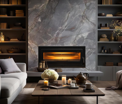
Built-In Fireplace Design for a Calm Home Sanctuary with Hydrofires

In today’s fast-paced world, the idea of home as a sanctuary has never been more important. Homeowners are increasingly designing spaces that promote calm, comfort, ...
-
Where Love, Craftsmanship & Creativity Meet – The Woodcentre

February arrives wrapped in warmth, creativity, and connection. With love in the air and summer still in full swing, the month invites designers, makers, and ...
-
This December, Go #BeyondColour with Festive Magic!

This December, our focus is all things festive! At Prominent Paints, we go #BeyondColour to bring summer joy into South African homes through inspired innovation ...


Visit SA Decor & Design on social media


