

Decorating With Pink
Despite what your preconceived notions may be, pink can look surprisingly modern when you know how to work it in. As much as moody hues and minimalism are having their moment, who can say no to a happy dose of color?
![]()
![]()
![]()
![]()
Ensure that you make a visual statement without going overboard by getting essential furniture in different shades of pink, then letting the rest of the room complement it. Your plan of attack is totally customizable to your current needs: looking for some new art? Prioritize pops of pink. Want a new accent chair to bring your room together? See if any rose hues catch your eye. You want your home to be a place you’re excited to come back to after a long day, and there’s no better remedy for “worst work day ever” than “snuggling up in some blush pink bedding.”
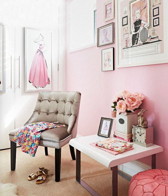
SUBTLE HUES
When in doubt, start off slow. For those not 100% sure about committing to a colorful life, pale and blush pinks offer a welcome hint of hue. And as an added incentive to switch, these shades are alternative neutrals, meaning that they can work well with a ton of other colors.
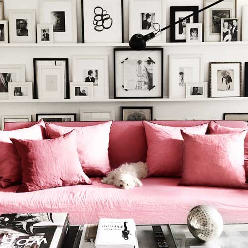
CLASSIC BRIGHTS
Cheery, bright pink instantly livens up your space. A bubblegum hue can make a strong impact, but displaying it in small ways (like glassware and art) helps to keep it restrained it in a tasteful way.
UNABASHEDLY BOLD
You’re confident, color-crazy, and never met a statement piece you didn’t like. Vibrant shades and unexpected patterns will wake up even the most vanilla decor.
Interiors by Annika von Holdt
Originally published on Apartment Therapy


You might also like...
-
Give Old Wooden Pieces New Life

There’s something rather magical about breathing new life into a piece of furniture that’s seen better days. Maybe it’s that solid oak dining table you ...
-
Elevating Surfaces: Discover the Luxury of Versus Paint in South Africa

In the world of design, true luxury isn’t overt — it’s found in the finish. It’s in the soft, sculpted texture of a wall that ...
-
Give Your Home an Autumn Comfort Makeover with Slumberland

As autumn arrives and the temperatures begin to dip, many homeowners start thinking about an autumn comfort home makeover. Our homes naturally become the place ...
-
Jax Oleum Opens Cape Town Showroom, Bringing Timber Expertise to the Western Cape

Jax Oleum proudly opened the doors to its brand new Cape Town showroom on Monday, 19 January 2026, marking a significant step forward in the ...


Visit SA Decor & Design on social media


