

2026 Goes Teal: Versus Paint’s Bold Colour Prediction
![]()
![]()
![]()
![]()

As the world leans toward sustainability, slow living, and meaningful design, colour trends are evolving too. For 2026, Versus Paint predicts Teal as the defining shade of the season. This rich fusion of blue and aquatic green blurs the line between land and sea. Rooted in nature yet undeniably modern, it symbolises regeneration, resilience, and an earth-first mindset.
Green has been steadily dominating décor for the past few seasons, but Teal takes it further. It is deeper than mint and more grounded than turquoise, offering sophistication without feeling cold. The hue invites calmness while still evoking creativity—making it perfect for tranquil bedrooms, mindful workspaces, luxurious living areas, and contemporary commercial spaces.
The Fluidity of Colour and Nature’s Influence
Teal reflects where the world is headed: towards balance. Inspired by aquatic depths, lush forests, and clean coastal living, this colour quietly bridges two worlds, suggesting health, wellness, restoration, and connectedness.
When paired with texture, it becomes even more powerful.
![]()
![]()
![]()
![]()

Where Texture Meets Tone: A Sensory Experience with Versus Paint
Versus Paint has mastered the art of design that can be felt. Its signature products offer both aesthetic depth and tactile sensory impact, creating a finish that is not only seen but experienced. With Teal tones, textured walls can mimic the velvet softness of moss, the gentle grain of stone, or the cool allure of ocean-washed surfaces.
The result is walls that lift the mood, soften the environment, and create a sense of refuge. Through high-end coatings and artisanal finishes, Versus Paint makes colour richer, more immersive, and more expressive.
Teal in a satin glaze becomes serene and contemporary. In a suede or metallic finish, it shifts into a luxurious, dimensional statement. Even a matte application feels grounded and organic—perfect for the sustainable, earthy palettes modern interiors are embracing.
Texture combined with colour is more than visual—it’s emotional. It can be soothing, comforting, and enveloping. In wellness environments, it promotes renewal. In homes, it fosters harmony. In hospitality settings, it conveys sophistication with heart.
Styling Teal in 2026
-
Pair it with natural woods, stone, brass, matte black, charcoal, or beige
-
Layer in linen, rattan, raw weaves, or natural fibres to enhance the organic feel
-
Use it for accent walls, feature rooms, statement ceilings, bespoke furniture, and artisan finishes
For Versus Paint, Teal is not just a trend—it’s a mindset. It signifies a move toward biophilic living, conscious design, and colours that reconnect us with the world around us.
In 2026, serenity is not only seen.
It is felt. It is layered.
Discover the Versus difference, where texture meets luxury.
Talk to a paint specialist at the Versus Paint Factory Store, Wynberg, Johannesburg.
Contact: www.versus-marketing.co.za
You can also visit your nearest Builders or Leroy Merlin for Versus Paint Black Friday deals this November!
![]()
![]()
![]()
![]()

Be more inspired here


You might also like...
-
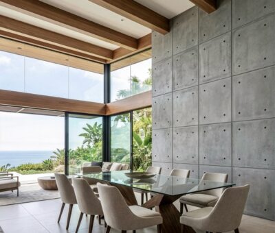
Transform Walls into Statement Features with Float Concrete Panels

There are moments in design when a wall does more than enclose a room – it defines it. Float Concrete’s lightweight concrete panels offer ...
-
Universal Paints: Come Explore Colour with The Colour Visualiser

If you’ve ever stared at blank walls wondering, “What colour would look good here?”, Universal Paints has a smart solution: their Paint Colour Visualiser. This ...
-
Stone Connection: Zim Black… Bold, Timeless, and Within Reach

Step into sophistication with Zim Black granite from The Stone Connection, a stone that redefines what it means to be effortlessly elegant. Its deep, ...
-
Paint Colour Perception: How Light, Shadow and Surroundings Transform Your Walls

Understanding paint colour perception is key to choosing the right shades — walls can look different depending on light, shadows, and surroundings. How Paint Colour ...


Visit SA Decor & Design on social media


