

Da Rocha Interiors: Bold Colour Schemes To Transition from winter to spring
Every year an invigorating palette of colours emerges from the latest launches and presentations at fashion and design weeks across the world. Be inspired and ready for spring with the latest tones from Da Rocha Interiors.
The season, as we transition from winter to spring, the hottest hues feature some more grounding earth tones and others more energizing accents including playful brights, spotted everywhere from Milan design week to the Paris runways.
Spring 2024 has been all about bold self-expression, quiet luxury and comfort. Whether you lean toward the boldness of hot pink and radiant red or the comforting embrace of browns and greens, there’s a trend for every personality and taste this season.
Here are some colour schemes trending this season:
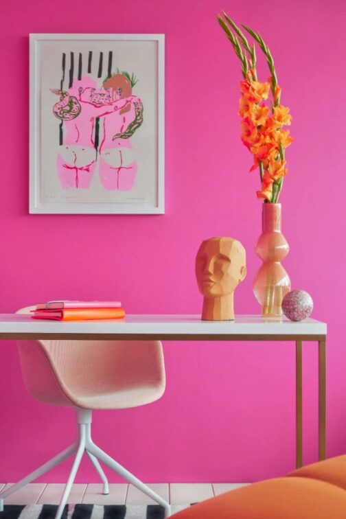
HOT PINK
According to trend forecasters, the Barbie movie and movement first ushered in the hot pink hue and it is still holding strong. The rise in global searches for ‘hot pink chair’ and ‘hot pink desk chair’ as a related query on Google Trends is an interesting example of how the appeal for high-octane colours impacts interiors, as stated by Gemma Riberti.
Although Google searches are onto something, the best way to use bright pink is as an accent—be it a chair, scatter cushion or piece of art.
![]()
![]()
![]()
![]()
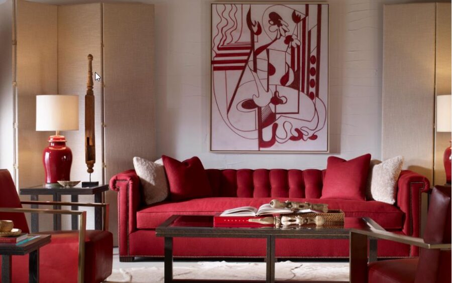
RADIANT RED
Red is another standout bright this season. This trending colour is coming up in solid colour applications both in apparel and in interiors. A pop of red will complement colours opposite and next to the hue on the colour wheel—green, orange, and violet. It’s a classic yet playful shade, ensuring it will remain relevant for many seasons to come.
![]()
![]()
![]()
![]()
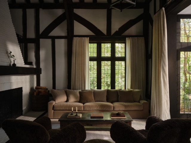
EARTHY BROWNS
Brown has taken centre stage as a response to the current economic and political climate. In times of uncertainty and upheaval, colours that are grounding, relatable, and dependable like greens and browns take the lead. Browns feel earthy, organic, warm, nurturing and artisanal. While brown does connect us to nature, interior designers are also describing “quiet luxury brown” as the new neutral.
![]()
![]()
![]()
![]()
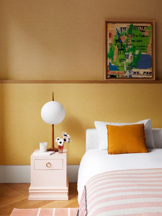
BUTTER YELLOW
Butter yellow is another en-vogue colour, highlighting its optimistic charm. “I love how sunny and relaxed it is without going full force into lemon territory,” says designer Shea McGee. This creamy, pastel shade is being used in wallpaper, paint, and accents like scatters, serving as a subtle yet effective mood booster. It’s an example of a dopamine colour.
![]()
![]()
![]()
![]()
TERRA-COTTA
Spicy, desert-inspired hues have also been popular of late, and terra-cotta is a spring standout. With its rich, earthy feel, it is a popular colour palette in living rooms and outdoor spaces. It is reminiscent of a chic island resort on holiday. Incorporating terra-cotta hues through ceramics, soft fabrics, or painted walls can bring a glimmer of vacation bliss and warmth to every day living.
RICH GREENS
Finally, deep, rich greens are making waves. Green is similar to brown in that it is also a grounding colour, organic and nurturing. Green is one of the seamless colours to incorporate in any interior style. It feels like a sophisticated and discerning alternative to safer neutrals.
Contact: Da Rocha Interiors.
You might also like.


You might also like...
-
Island Villa Dubai by SAOTA and ARRCC: Contemporary Coastal Barefoot Luxury Overlooking the Arabian Sea

Along Dubai’s constructed shoreline, Island Villa emerges as a study in barefoot luxury – a coastal home shaped as much by restraint as by view. ...
-
Black Pearl Interiors: Modern Coastal Design Inspired by Light, Texture, and Timeless Elegance

There’s a certain poetry to coastal light – the way it softens edges, deepens shadows, and lends everything it touches a sense of calm. The ...
-
A Bold Reinvention: David Muirhead Transforms the Grand Hotel at GrandWest

The Grand Hotel at GrandWest Casino and Entertainment World has unveiled its striking new Salon Privé, lounge, and dining area – the first milestone in ...
-
Spier’s Exclusive Villas Redefine Country Luxury

On the banks of the Eerste River, where wild Cape gardens meet heritage architecture and sweeping mountain views, two new villas are reshaping the notion ...


Visit SA Decor & Design on social media


