

#ClayPot Is The Versus Colour of the Month
Inspired by nature and the earthenware Terracotta, #ClayPot is an all-rounder colour designed to please. No matter the season or atmosphere, this hue is an extension of the natural world that seamlessly ties in with most colour palettes and spaces.
![]()
![]()
![]()
![]()

While this colour may be bolder than most on the neutral palette, it compliments rooms with good natural lighting, making the space feel warm and cosy.
Accent colours like pink, red, green, cerulean blue, and muted whites work well with this earthy hue.
![]()
![]()
![]()
![]()

For those looking to evoke a warm, sun-baked feeling in the space, this is the colour of choice!
![]()
![]()
![]()
![]()

Get yours online www.versuslifestyle.com
Also available at Versus Paint Direct Wynberg and Leroy Merlin South Africa
Proud sponsors of Decorex Africa
#Versus20yrs #VersusPaint #ImagineWhatWeCanDoForYou


You might also like...
-
Hendre Bloem on Designing the Oranjezicht City Farm Market in Cape Town

Defined by clean lines, material honesty and meticulous attention to detail, Hendre Bloem’s work speaks to a refined, contemporary vision of luxury. Through Hendre ...
-
La Monique: Oceanside Glamour in the Heart of Santa Monica

Hollywood Regency Meets Riviera Elegance At Oceana Santa Monica, La Monique transforms the hotel’s oceanside setting into a cinematic French brasserie. Designed by Martin Brudnizki ...
-
Nina Sierra Rubia Appointed Principal at ARRCC: 21 Years of Global Design Excellence

Interior design, at its most refined, is an act of translation, of listening deeply, distilling meaning, and shaping spaces that feel both personal and ...
-
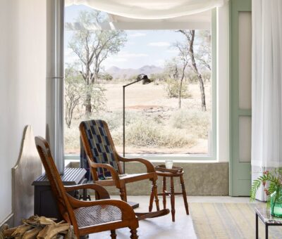
Nooishof — A Desert Homestead Where Architecture Meets Silence

Perched between the ancient Namib Sand Sea and the rugged Tiras Mountains, Nooishof unfolds like a meditative composition in space and light. It presents a ...


Visit SA Decor & Design on social media


