
Paintsmiths: Colours & Paint Techniques For The Perfect Home
Your walls are an extension of your home and should also be an extension of your personal style. Add a splash of colour or an exciting paint technique to breathe new life into your residence. Today we’re talking about some of the latest colour trends from Paintsmiths.
GREY – is it warm or cold?
It’s a beautiful neutral tone but there are a few variations of grey that you should consider before choosing the right grey for your space. Grey has distinct undertones that can either be warm or cool tones. For example, certain greys feature blue, purple or green undertones which are considered cool colours. Grey can also feature warm undertones like orange, yellow and red. To ensure a successful design scheme, be sure to coordinate grey paint undertones to your interior finishings.
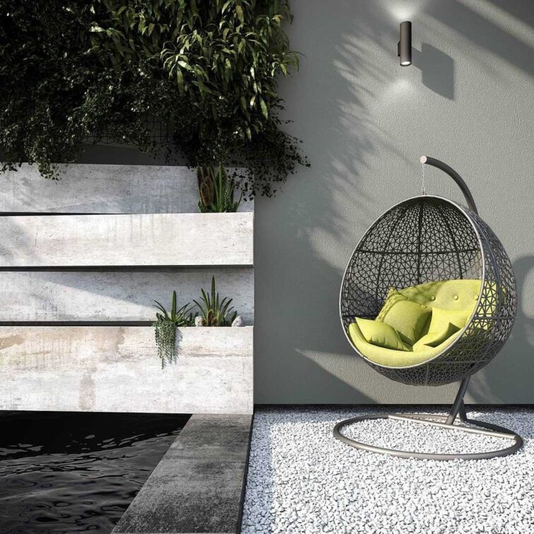
Visualized by @hgouws.renders Featuring @paintsmiths_sa Fresco wall paint .
As a neutral colour, grey is equally appealing inside and outside the home. Midas’s Envirolite Fresco paint available from Paintsmiths is a beautifully textured paint. This gritty, matt textured exterior paint has subtle graded nuances and is a good fit with both country and urban architecture. This popular textured Midas paint, used mainly on exteriors, is a premium finish and it provides a robust solution for concealing plaster imperfections and shrinkage cracks.

Think outside the wall! The Pandomo Wall is available from all Paintsmiths stores countrywide and comes in a range of colours from muted earthy tones to bolder saturated colours. A truly eye-catching finish for any space. Pandomo has the appearance of polished marble with its swirly veins.
The Pandomo Wall
Pandomo makes for a magnificent and eye-catching wall. It’s the swirly veined look of two elements colliding and an intensity of colour that feels likes it’s from another planet. It has the look and feel of polished marble with modern lustre.
Pewter
Named for the metal which is comprised primarily of tin, pewter is a darker shade of grey. Pewter retains the grey characteristics of neutrality and seriousness, and its darker hue conveys a certain weightiness. As a neutral colour, it plays well with just about every colour in the spectrum. the colour has a range of blue undertones and a darker, more matte sheen than other greys. It is particularly captivating as a statement wall in a living room or bathroom.
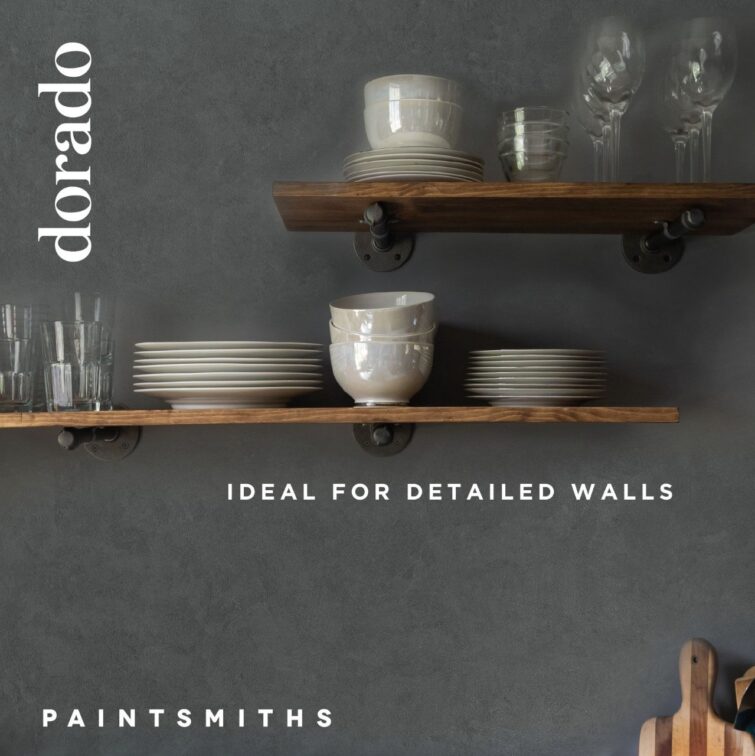
Dorado Paste in the colour ‘Pewter’. Dorado is like shimmering velvet. A sensuous, silky, layered effect that is smooth to the touch. Available in 4 striking, light-animating colours, with 9 new additions coming this month. Dorado smooth/paste creates a distinctive multi-toned and luminous finish that adds unprecedented depth to walls.
Soft Pink
This season we are also embracing soft feminine tones such as pink and blush. This is a great way to add a little playfulness to a room. Subtle touches of pink can further create warmth and depth in a room, and it certainly is a bright and happy tone, that should not only be reserved for children’s spaces!

Wall done in Earthcote Pandomo – Duzi Mud and a custom pink in Midas 240
There are various shades of pink that can be incorporated into your space. Each shade therefore has a different feel and can help you achieve a more personalised look. In interior design pink often symbolises love and passion in a gentle way. Many shades of this happy colour are also youthful and sweet.

Mumbai Pink has an unmistakably organic feel, bringing a little bit of nature into your home. A warm clean pastel to consider for a neutral wall or as an accent.
Cool Blues
Blue is a bold colour and often hints at the sky and the ocean. In interior design, it is typically ascribed qualities such as purity and tranquility. According to design professionals. if combined with warmer and more energetic colours, blue furthermore inspires confidence and serenity.
Some of our favourite shades of blue include aqua, navy and indigo.
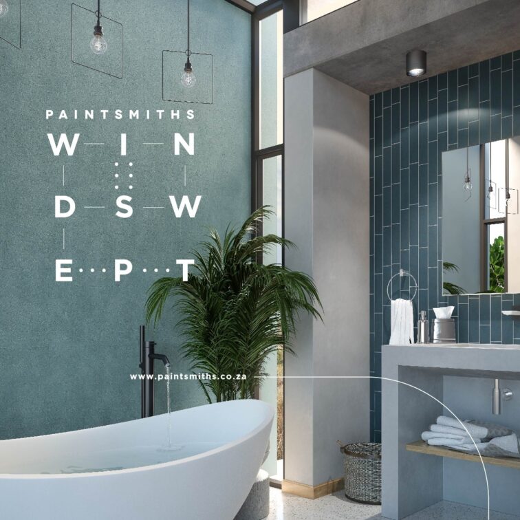
Windswept speaks to peace and calmness. A paint that reminds one of the residue that forms on a sheet of well-used waterpaper. (colour: Lamie Blou)
Earthcote’s Windswept
The residue that forms on a sheet of well-used waterpaper and the look of powder-dust that settles on all the surfaces of a surfboard shaper’s workshop echoes the mist-soft nuances of a coat of windswept. Windswept is designed to age and bloom just like traditional limewash. We love this paint in a trendy shade of blue!

Walls painted in the Paintsmiths Midas 300 colour range: FLORENCE BLUE
Black
Possibly the boldest colour of them all… black is a timeless classic. When paired with any other colour, it becomes a bold statement shade that will pick up on the ambience of the other tones used in your room.
Furthermore, black signifies simplicity and functionality. This colour often works best in modern interiors. On a psychological front, an all-black room can be overwhelming and gloomy. However, if you pair the colour with red, white, blue, or almost anything else, it provides excellent contrast.
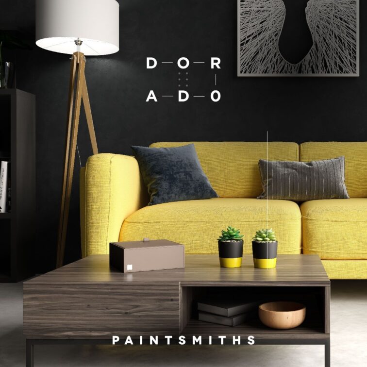
Paintsmiths brings you Earthcote Dorado Paste in the newly launched colour ‘Pik swart’. As the name suggests; a shimmery black on black for the most lustrous, deep texture.
Find your perfect colour in the finish of your choosing at Paintsmiths. As long-standing paint merchants with a lifetime of collective knowledge from the leading paint experts Midas and Earthcote and with roots deep in the trade and customer experience, Paintsmiths are delighted to now offer an innovative, consumer-friendly, retail destination which addresses all your quality, price, service and convenience coating needs in a series of bespoke, solution-based stores.
Visit Paintsmiths.


You might also like...
-
Exciting New Shows Coming to The Home Channel in January 2026

The Home Channel is kicking off January 2026 with a fresh slate of exciting, brand-new programming designed to inspire, entertain, and delight viewers. Leading the ...
-
Tree House at Las Faldas Forest Retreat | Perfect Hideaways

There are certain buildings that feel less constructed than discovered; spaces that seem to emerge quietly from the landscape itself rather than impose upon it. ...
-
Embracing Autumn Interior Design Ideas: Warm Textures & Restorative Spaces

Interiors are starting to mirror the rhythm of the season — softer light, richer tones, and a deeper sense of comfort. Deco Surfaces has observed ...
-
Introducing Doshi Retreat

Set within the renowned Vitra Campus in Germany, the Doshi Retreat is a powerful new architectural intervention that invites stillness, reflection, and sensory awareness. Designed ...


Visit SA Decor & Design on social media


