
Colour trends 2024 highlights a fresh, new mood: boldness and confidence in your decisions with House Of Interiors.
The days of soft, light palettes that created”safe” interiors are gone. Today, multidimensional interiors using layered tones and deep shades are the trend. Take a look at this list of trending hues from House of Interiors for 2024 to help you navigate the interior design trends for colors and give your spaces a brand-new identity.
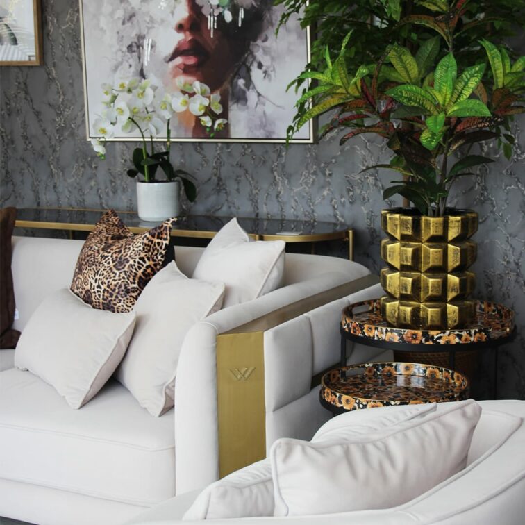
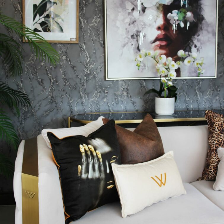
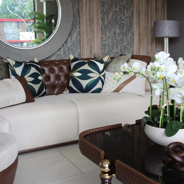
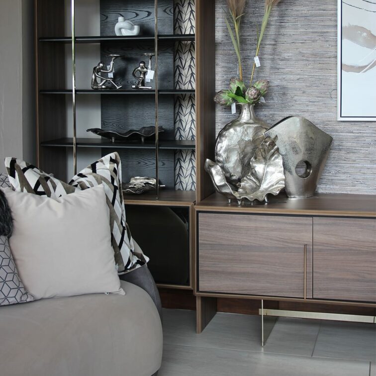
Grey
Grey is a beautiful color for many homes because it is easy and flexible. Consider a warm grey wall paint because it offers a bright, off-white tone with a lively airiness during the day and a cozy warmth at night. Elegant and sophisticated, the walls will shine even brighter in combination with a yellow table or chair. If you want a more earthy bedroom or a living room, keep your eyes peeled for mushroom gray. It’s a warmer counterpart to traditional grey with warm undertones, and it’s one of the colors that’s trending, with its roots in nature.
![]()
![]()
![]()
![]()
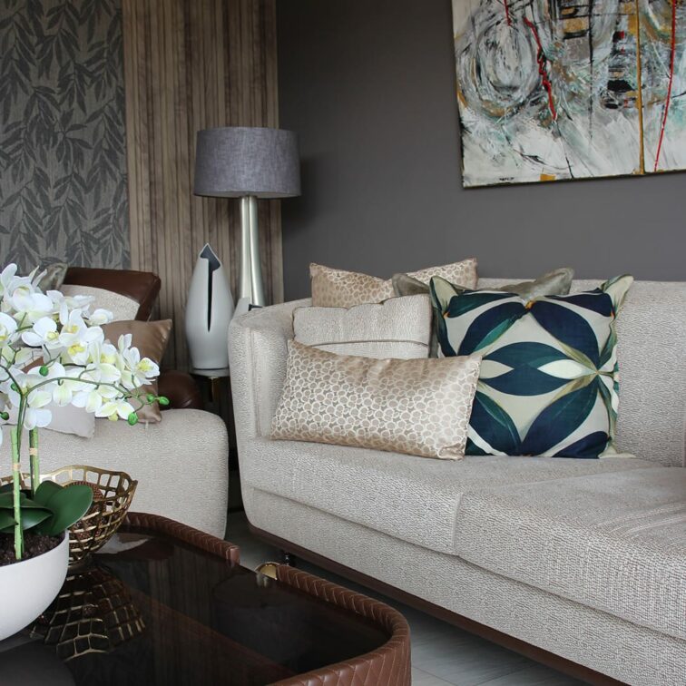
Dark Green
Dark green shades are increasing in the interiors and for the right reasons. For those who do not know how to use hues such as black, red, or dark blue, it is very easy to bring in dark green to create an impact while giving the spaces a grounding effect. In addition, if you choose colors that go with dark green, you can push the boundaries of what you can do with this moody color.
![]()
![]()
![]()
![]()
Pistachios
Pistachio colors are all the rage right now, with deep forest greens giving way to soft sage greens and soft pistachio tones. The retro meaning creates a happy and positive shade and eliminates the coolness of green. Soft, natural pistachio works wonders on simple, plain walls, and especially when paired with white tones and natural wood tones, it makes the perfect backdrop for large, sunny spaces such as wide entryways, large dining rooms, and spacious family rooms. Do not confuse pistachio with its brighter cousin called chartreuse, which has a very bright, eye-catching vibrancy and richness.
![]()
![]()
![]()
![]()
Gold
Pay attention to materials and paints to add color to your home, and enjoy the richness of a touch of warm brass. These materials, with their natural sheen, reflect and complement other colors in the room and add that touch of luxury we seek in our lives. For spaces like the living room, family room, or guest room, consider gold tones paired with white walls and light, natural-toned wood floors, along with a variety of green plants in art, rugs, and modern lighting. Then add an oversized cotton blanket and textured pillow for some golden warmth. Then add more hints of gold to the shiny brass of furniture handles and knobs, curtain rods and rings, and door handles and hinges. The result is a colorful and dramatic space that balances warm and cool colors with small pops of shiny, warm metals to serve as decoration for the room.
![]()
![]()
![]()
![]()
Jade
Hints of gold, emerald, and jade are appearing in interiors around the world, showing people how to decorate in jewel tones. Pale blues and greens, inspired by the natural colors of the gemstone itself, are becoming increasingly popular, and depending on how they are used, they can create both a calming and vibrant aesthetic at the same time. There is no wrong way to use jade in your interiors. It pairs beautifully with white, taupe, peach, pink and even the classic glossy red. Looking back at the history of interior design, there is no denying the impact the use of jade has had on us over the centuries. Exotic and rare in the 1850s, it flourished in the 1920s and re-emerged in modern designs in the 1970s. For the master bedroom, consider jade green walls with a soft, moody texture, then repeat the jade color in the bedding along with natural linen curtains and rugs. The monotone and calm jade color scheme adds calmness and sophistication, adding an exotic feel to any interior space.
![]()
![]()
![]()
![]()
Honey Tone
“Honeytone is really warm and sexy. They set the tone. The honey tone of the room screams, “I am charming, carefree, and energetic.” Applying a small patch of color initially can help build confidence before applying it to the wall. The modern color scheme of the bathroom and kitchen and the harmonious colors of the tiles and walls provide a sense of unity to the space.
![]()
![]()
![]()
![]()
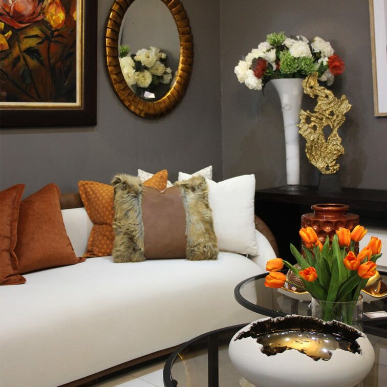
Warm Beige
Our love for neutral colors is back. Bedroom trends, in particular, help create a calming atmosphere and a haven for relaxation. Warm, earthy cream colors work well with soft terracotta or deep red tones to add depth to a space. Remember that in a neutral scheme, layers of texture add tactility and interest, giving a space a unique feel. Following today’s color trends, artwork, pillows and curtains that accent a space with beige accents can create a three-dimensional effect without compromising the bold effect, especially against a dark background.
![]()
![]()
![]()
![]()
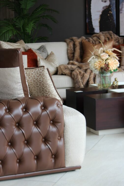
Brown
Yes, Brown is back. And it looks better than ever! Because brown is often perceived as drab or boring, designers and stylists are helping us see the color in a new light. Bringing a rustic yet sophisticated tone to any interior, the brown living room is full of drama.
![]()
![]()
![]()
![]()
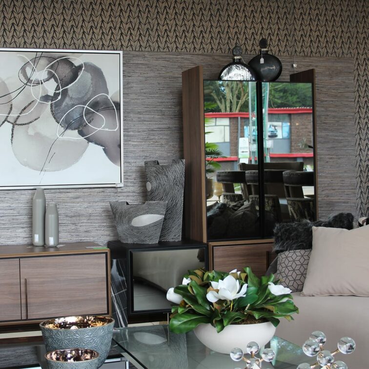
Neutral stone shades
The neutral trend is increasingly moving away from cool grays and traditional cream tones towards warm neutral stone tones. For an earthy living room or bedroom, consider colors like taupe, rust pink, and sandy pink. The earthy tones of the stone evoke a sense of grounding and connection to nature, which is so important in California style. This tone is ideal for creating a cozy and cozy interior. For example, shades like slate gray mimic the look of natural stone and are suitable for both modern and industrial spaces. Sandstone and terracotta are also gaining popularity, especially as they add warmth to Mediterranean or rustic-themed interiors. Additionally, light stone tones such as travertine or limestone were used to add an airy feel to the space.
![]()
![]()
![]()
![]()


You might also like...
-
February: A Season of Connection and Style

This February, Easy Ivy celebrates connection in its most elegant forms—through industry inspiration and the romance of interiors. Where Ideas Come to Life Easy Ivy ...
-
Give Your Home an Autumn Comfort Makeover with Slumberland

As autumn arrives and the temperatures begin to dip, many homeowners start thinking about an autumn comfort home makeover. Our homes naturally become the place ...
-
Earthy, Curved and Conscious: How Florastyle’s Japi Planters Capture 2026 Decor Trends

In 2026, design moves firmly toward warmer, more human spaces, and Japi planters from Florastyle align naturally with these shifts. Grounded in lightweight durability and ...
-
A Valentine’s Day Ritual: Slow Down, Soak, and Spoil Someone You Love

Valentine’s Day is often associated with grand gestures, crowded restaurants, and frantic last-minute gifts. But at Coal Interiors, the belief is that the most meaningful ...


Visit SA Decor & Design on social media


