

How to balance the metallic trend in your interiors
When looking at the range of metallic lights at The Lighting Warehouse, there’s no doubt in our mind why the trend keeps on evolving across the board in interiors. Adding a touch of metallic to your interior décor composition is a great way to making the space in question infinitely more glamorous. however the key with this look is adding to the space instead of overdoing it.
Here’s some tips on how to create a balance:
The soft touch
Mix metallics in with different, softer textures to balance them out.
A neutral palette
A neutral monochromatic colour palette will really make the metallic lighting you use stand out. Metallics pair fantastically with darker hues that are so in vogue at the moment, such as grey, black, navy or a variety of deep, rich jewel tones. Alternatively, you can keep the palette light and bright, with a variety of shades of white.
Like attracts like
Try and use the same form of metallic throughout, such as brass for example, but mixing it up in various finishes or textures.
Start small
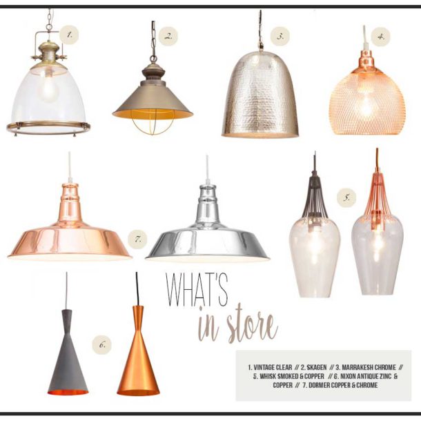
It is a better idea to incorporate small doses of metallics into your décor, instead of choosing one large permanent piece that can often be a little overwhelming. Small accent pieces and lighting is a great place to start – as they are easy to interchange and move around until you find the perfect balance. For a vast range of metallic lighting, browse The Lighting Warehouse collections here: ![]()
![]()
![]()
![]()
 Contact: The Lighting Warehouse


You might also like...
-
Litehouse Lighting: Light Up Spring Evenings with Litehouse Lighting

As warmer weather approaches, there’s no better time to refresh patios, gardens, or balconies. With Litehouse Lighting, creating a beautiful and welcoming outdoor space isn’t ...
-
A Fresh Start: Lighting the Way Into a New Year

There’s something about the weeks leading into a new year. The tree is still up, the house still smells faintly of cinnamon and citrus, but ...
-
Modern Vintage: Lighting the Season of Light

As summer arrives, interiors begin to shift. Heavy fabrics and moody palettes make way for breezy linens, natural textures, and a lightness that feels both ...
-
Woven Lighting for Warm, Natural Interiors | The Lighting Warehouse

Natural materials have a way of quietly returning to relevance, and woven lighting for natural interiors is no exception. As seen across collections from The ...


Visit SA Decor & Design on social media


