

DDL: The Hottest Colour Trends of Winter 2017
It’s that time of the year again where we see new trends and must-have pieces that we can’t wait to update our homes with. But how do you warm up your home this Winter? That’s easy! Reinvigorate your décor with pops of this season’s trendiest colours.
![]()
![]()
![]()
![]()
 It’s that time of the year again where we see new trends and must-have pieces that we can’t wait to update our homes with. But how do you warm up your home this Winter? That’s easy! Reinvigorate your décor with pops of this season’s trendiest colours. Pantone, the global authority for professional colour standards in the design and décor industry, has offered the following as this year’s seasonal design inspiration, key colour direction and suggested colour harmonies for your home:
LUSH MEADOW: Add this rich, bright colour to your interior for a feeling of overall elegance and panache. Pegged as 2017’s hottest colour, you can use this green as a base colour, or as an accent colour to bring out greys and woods. ![]()
![]()
![]()
![]()
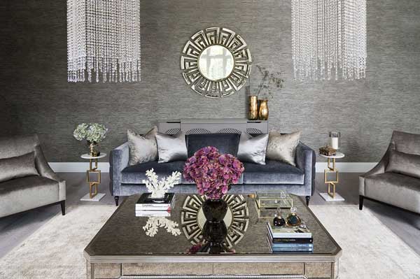
 AIRY BLUE: Create weightless serenity by pairing Airy Blue with Warm Taupe, Lush Meadow or Dusty Cedar as foundation colour.
 ![]()
![]()
![]()
![]()
 RIVERSIDE: As a dominant statement colour, Riverside embodies a subtle sophistication that is both exciting and calming. Use it with warm golds, creams and dark woods to bring out the royal effect.
 ![]()
![]()
![]()
![]()
 DUSTY CEDAR: From a polished, refined style to a more edgy representation, you can turn little accents into big statements with this unexpected, yet completely versatile, colour. Pair it with some gold to bring out that dusty rose-toned pink shade.
 ![]()
![]()
![]()
![]()
 WARM TAUPE: Warm Taupe is a sound, timeless foundation colour that suggests stability and grandeur. It works great as a base or background colour, as well as a finish on a piece of furniture, a stain for wood beams, or a wall colour.
 ![]()
![]()
![]()
![]()
 POTTER’S CLAY: Potter’s Clay is the perfect winter colour in this collection. Use as a foundation colour for an added degree of sophistication and luxury. Potters’ Clay is also used really well with red tones and neutrals in the cream or brown family. Add dark plums and greys for a refined look.
 ![]()
![]()
![]()
![]()
 AURORA RED: If you feel like packing a punch, try Aurora Red for a sensual statement of undeniable confidence and excitement. This shade of red pairs very well with any neutral and earthy tones, especially as an accent colour to your designs.
 ![]()
![]()
![]()
![]()
 SPICY MUSTARD: Add an unexpected zest to your Winter décor with abstract and geometrical accents of Spicy Mustard. More than just a yellow, this colour adds an uplifting sense of vibrancy.
 ![]()
![]()
![]()
![]()
 Design and Décor Lab has years of experience in turning fashionable décor trends into lasting designs that express your own personality. By following these world-class trends, and mixing it with their own innovative concepts and ideas, the talented team at Design & Decor Lab makes sure that their designs work for you.
The original article features here.


You might also like...
-
Blurring the Boundaries: Nature-Inspired Living for Modern Spaces

As the seasons turn and the light grows warmer, design takes a deep breath. Across homes and workplaces alike, the boundary between inside and out ...
-
Dancing on a Cloud: Styling Pantone’s Colour of the Year with Effortless Elegance

Every year the design world waits to see which colour will set the tone for interiors, fashion and lifestyle trends. For 2026, the spotlight ...
-
The Live Edge Perspective: Nature’s Influence on Modern Interior Design

In contemporary interiors, there is a quiet shift taking place. Spaces that once favoured sharp minimalism are beginning to welcome warmth, depth, and materials ...
-
Rugiano Sofas: Where Italian Craftsmanship Meets Sculptural Comfort

Rugiano has long understood that true luxury is felt as much as it is seen. Its sofas are not conceived as standalone objects, but ...


Visit SA Decor & Design on social media


