

Italtile: A Roundup of SA Decor Trends for 2018
South Africa may have been a little design backwards a decade or two ago. No longer. We take international trends and bend them, such rebels that we are. We grow our own, too. And not surprising, seeing as we’re one of the most colourful and diverse nations on the planet.
Italtile brings us a snapshot of the latest trends…
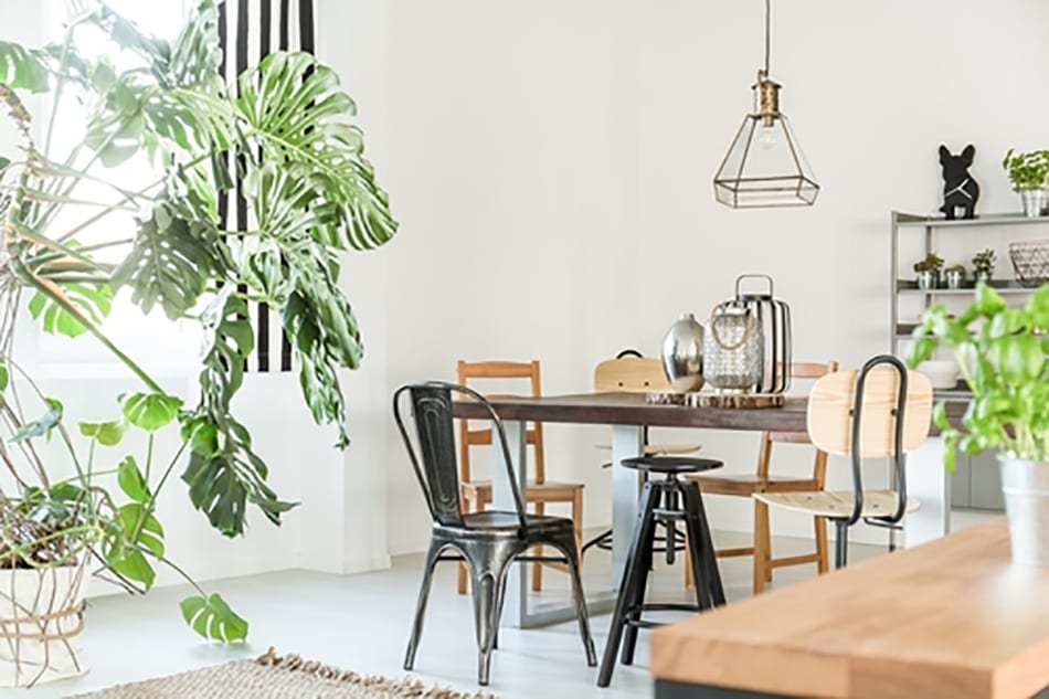
Hygge and Lagom
![]()
![]()
![]()
![]()
 You’ve seen ‘hygge’ all over the internet. You may even know how to pronounce it.
If not, it’s ‘hugh-gah’. It’s a trend category, more than a trend. It covers everything that is cosy and comfortable. Hand-knitted gloves and homemade cocoa are hygge.
Giant ‘arm-knitted’ throws are hygge, and they’re also still huge!
Gorgeous, ‘pre-lived’ floors that your toetsies want to walk on barefoot… they’re very hygge.
And lagom? What the actual? Another Nordic concept. Quite simply, it means ‘simplicity’. Not stark. But rather, the curation of fewer, meaningful items that are beautifully functional and functionally beautiful. The de-clutterisation of hive-like busy-ness the trick is to resist filling a space with stuff. Let your rooms breathe.
Of course, it’s possible to combine the best of both worlds. The Scandi dream of comfort and simplicity, hand in hand.
Black black black
![]()
![]()
![]()
![]()
 Not just black, but matte black. Such class. Such sex appeal. Such sophistication.
Matt black’s going into the kitchen and the bathroom. And we couldn’t be happier.
The jungalow
The garden’s full of furniture and the house is full of plants. How’s that for tipping the world on its head? Vivid tropical fabrics and wallpapers, plants in pots, in vases, you name it. Lush, botanical themes are happening like crazy. Greenery’s red hot, baby.
Gigantic wall art
Forget one polite piece lot in a sea of wall. Now it’s big, bold, showstoppers that cover a wall, whether a huge canvas, or a custom wallpaper.
Amadeus
The Plascon Colour of the Year. A neutral, earthy, yellow-tinted hue that works to bring a space together while the neutral character brings in a harmonising, grounding energy. A magnificent backdrop to build your spaces around.
Texture mixes
Right now, the most popular textures to mix and match are wool, leather, fringe, natural woods and metallics.
The open closet
![]()
![]()
![]()
![]()
 Rip off your closet door right now and reveal your fashionables in all their glory.
Of course, not just trendy, the open closet is a brilliant solve for small apartment living. There are so many gorgeous and original ideas on Pinterest to get your little grey cells working.
Maximalism
The joy of so many trends is that we can all express our individuality in so many diverse ways. As much as Lagom is the ‘less is more’ décor, there is the glorious profusion of maximalism. More is more. More patterns, more colour, more layers, more contrasts… it’s all about inclusivity and eclecticism. This needs a careful eye and a guiding hand, to make your spaces sing rather than shriek!
Four hot tile trends
![]()
![]()
![]()
![]()

Tile trends is a blog in itself. But for now, here are four super-duper-divine trends.
Move over high gloss, here come the mattes for quiet, satiny, understated elegance.
Different shapes, for drama: hexagons, pebbles, herringbone, you name it.
The textured tile brings 3D drama to any space. The wood look: from real wood, to engineered wood, to incredible, low maintenance, durable digitally printed porcelain tiles that reimagine all the feely touchy beauty of wood.
Organics
Bring nature home to nurture you and yours. Textural linens, jute carpets, re-purposed wood and bamboo. Raw, unfinished, rough and real, organics help you live a life filled with authentic energy.

Pastel power

Powdery pales have swept winter’s velvety darks away, and they’re going to take us gelato-lovers right into 2019 and beyond. Pastels are the new neutrals. Lilac and Lavender, the softer, gentler sisters of Pantone 2018’s screechy Ultra Violet. Tea Rose rather than bubblegummy Millennial Pink. Peach, the love child of Pink and Orange. Celadon, celery and avocado – the new greens. And lemon yellow, more muted than you’ve ever seen it before. Mix them, match them, like you would with a triple scoop of ice cream. Mmmm. Delish.
![]()
![]()
![]()
![]()
 Choices, choices, choices! But fear not. The design doctor’s in the house and she says… at the first sign of design dizziness, go and speak to an Italtile design-certified sales adviser. Together, you’ll put together mood boards with the looks you like, and you’ll leave with samples to try out at home… with a glass of vino to steady the nerves.
For more visit Italtile.


You might also like...
-
Natural Stone Interiors: Why Designers Are Returning to Authentic Materials | Mazista Tiles

There’s a quiet revolution happening in interior design, and it looks a lot like the earth itself. At Mazista, this return to authenticity has long ...
-
Bali Azul: A Serene Expression of Tropical Luxury in Porcelain

Bali Azul transforms interiors into peaceful retreats through the soothing allure of its richly hued porcelain surface. This 150x150mm tile, crafted with precision and passion, ...
-
FINoak Atelier Engineered Hardwood Flooring | Architectural Oak by FINfloor

In contemporary interior design, flooring has evolved far beyond a functional surface. It has become an architectural statement—an expressive layer that defines mood, texture, and ...
-
Como Flooring: Eggshell Oak for South African Interiors

There is a rare and unmistakable feeling when stepping into a space that simply feels right. With Como Flooring, it is not loud or attention-seeking, ...


Visit SA Decor & Design on social media


