

Colour Psychology in Interior Design: How Spaces Influence Mood
![]()
![]()
![]()
![]()
Ever walked into a room and immediately felt like you could either run a marathon or fall into a deep, dreamless slumber? No, it’s not just the caffeine (or lack thereof). It’s the walls talking. Well, technically, it’s the colours on the walls whispering sweet nothings to your hypothalamus. Color psychology isn’t some high-concept interior design myth concocted by people who sell £80 pots of “Elephant’s Breath” paint. It’s actual, honest-to-goodness science that dictates how we feel, breathe, and interact with the world around us.In 2026, we’ve moved past the sterile “millennial grey” era and into something far more emotive, where every hue is a calculated mood-setter.
The Dopamine Hit: Warm Tones and the Social Buzz
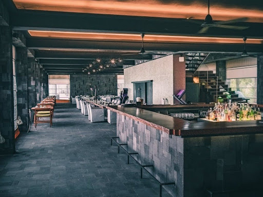
Let’s start with the high-energy stuff. If you’ve ever found yourself lingering over a second glass of red in a dimly lit bistro, you’ve been played-in the best way possible. Reds, oranges, and yellows are the extroverts of the colour wheel. They don’t just sit there; they demand attention.Red, specifically, is a biological firestarter. It physically raises your heart rate and nudges your blood pressure north. Interestingly, it also fires up the neurons in the hypothalamus responsible for appetite. This is exactly why you’ll see these fiery palettes in the world’s most addictive social spaces.
Take a look at Haylaz Brasserie. While you might be there for the Mediterranean-inspired feast, the interior is doing half the work. The warm, inviting glow and the rich, sunset-inflected tones create a space that feels inherently social and high-energy. It’s the kind of environment that practically forces you to put your phone down and actually talk to the person across from you. Designers often call this “appetite engineering.” If a room feels like a warm hug, you’re probably going to stay for dessert.
But yellow is a trickier beast. It’s the colour of sunshine and optimism, sure, but in high doses, it can lead to visual fatigue. Ever noticed how fast-food joints use bright yellow? It’s not just to look cheery; it’s to create enough subtle “urgency” that you eat your burger and get out to make room for the next person. In 2026, the trend has shifted toward “Bronze Ochre” and “Honeyed Neutrals”-shades that offer the happiness of yellow without the headache.
The Great Reset: Why We’re All Obsessed with Blue and Green
If the warm spectrum is a shot of espresso, the cool spectrum is a long soak in a forest-scented bath. We’re currently living through a massive “Blue Mind” revolution. This theory, popularized by marine biologist Wallace J. Nichols suggests that being near (or looking at) water-inspired shades lowers cortisol levels and slows our breathing.
It makes sense, then, that Dulux’s 2026 “Colours of the Year” are a family of soulful indigos like “Slow Swing” and “Mellow Flow.” These aren’t just pretty shades; they’re a digital detox in paint form. In an age where our screens are constantly screaming for attention, a deep teal or a midnight navy offers a “cinematic reset.” According to research from the University of British Columbia, blue hues specifically enhance creativity by creating a sense of psychological safety (Moutray, 2025). When you feel calm, your brain finally feels brave enough to think outside the box.
Then there’s green-the ultimate peacekeeper. Because our eyes are evolved to detect the slightest variations in green (a survival trait from our foraging days), it’s the easiest colour for the human eye to process. It requires zero effort to look at. This is why “Botanical Greens” are dominating office designs right now. A leafy, moss-toned wall can actually improve productivity by 6% simply because your brain isn’t wasting energy trying to make sense of the room.
The Social Architecture of Atmosphere
Sometimes, the psychology isn’t just about a single wall colour; it’s about the “vibe” created by the material world. Think about the heavy, grounding energy of an old-school hall. Reichenbach Hall is a prime example of this. It’s a space that leans into the psychological power of wood and amber light. There’s something deeply communal about high ceilings paired with warm, golden tones. It evokes the feeling of a historical guild hall or a traditional tavern, tapping into a collective memory of safety and celebration.
Notably, wood isn’t just a texture; it’s a colour story of its own. Browns and tans represent stability and reliability. When you pair those earthy foundations with the right lighting, you create a “social lubricant” that makes strangers feel like neighbors. As interior designer Kelly Wearstler famously said, “Color has the power to transform a space, evoke emotions, and tell a story.”In spaces like these, the story is one of belonging.
The New Neutrals: Beyond the Boring
For a while, “neutral” was a dirty word in design circles. It meant beige, boring, and safe. But in 2026, neutrals have found their soul. We’re seeing a shift toward “Sandstone Beige” and “Mahogany”-colours that feel rich and “cocooning” rather than just empty.
A key takeaway is that white isn’t just “the absence of colour.” It’s a tool for clarity. However, too much clinical white can trigger a “sterile” response, making people feel like they’re in a hospital waiting room. The fix? Layering. A successful room uses “tonal” design-layering different shades of the same neutral to create depth. It’s the difference between a flat piece of paper and a crumpled silk sheet. Both are white, but one has a mood, and the other just is.
Cultural Identity and the Earthy Soul
Color doesn’t exist in a vacuum. Our reaction to a shade is often filtered through our heritage and history. For instance, while white symbolizes purity in the West, it’s the colour of mourning in many Eastern cultures. This cultural context is why “Global Earth Tones”-terracotta, clay, and rust-are so popular in restaurants that want to feel “authentic.”
Take LIVIN’Italy, for example. The aesthetic here isn’t just about looking good on Instagram; it’s about evoking the sun-drenched, rustic warmth of the Mediterranean. The use of baked clay tones and earthy textures communicates a sense of heritage and “slow living.” These colours tell your brain that you aren’t in a rush. They encourage a “linger longer” mentality that is essential for the Italian way of life. Interestingly, these red-earth tones provide the warmth of red without the “danger” signal, making them the perfect compromise for a cozy, grounded dining room.
Lighting: The Invisible Paint
You can spend a fortune on the perfect shade of “Midnight Teal,” but if your lighting is wrong, it’ll just look like a muddy grey. The “Color Rendering Index” (CRI) of your lightbulbs is the secret sauce. In 2026, smart lighting systems can actually change the colour temperature of a room throughout the day to match your circadian rhythm.
- Morning: High-Kelvin, blue-toned light to suppress melatonin and wake you up.
- Evening: Low-Kelvin, amber-toned light to mimic a sunset and prep you for sleep.
When the light hits the pigment, the mood shifts. A blue room that felt inspiring at 10 AM can feel cold and lonely at 10 PM if it isn’t warmed up with the right lamps.
The Final Verdict
So, what’s the move for your own space? Don’t just follow the trends. Think about how you want to feel when you walk through the door. If your bedroom is your sanctuary, lean into those indigos and sages. If your kitchen is the heart of the home, don’t be afraid of a splash of terracotta or a bold, sunset orange.
Interior design is the only art form we literally live inside. The colours we choose are the backdrop to our lives, the silent partners in our morning coffee, and the comforting blankets at the end of a long day. From the energetic pulse of Haylaz Brasserie to the grounding warmth of Reichenbach Hall and the soulful, sun-soaked vibes of LIVIN’Italy, the lesson is clear: colour is a superpower. Use it wisely.


You might also like...
-
House Nel: A Contemporary Coastal Home Showcasing Luxury Design in Mossel Bay

In the heart of Mossel Bay, House Nel emerges as a masterclass in relaxed coastal living—a bespoke holiday residence that seamlessly blends elevated luxury with ...
-
Celebrate Summer with Tinzeltown

Madonna was right, we’ve all been true blue for long enough. But now that the sun’s out and the skies are clear, blue is ...
-
A Bold Reinvention: David Muirhead Transforms the Grand Hotel at GrandWest

The Grand Hotel at GrandWest Casino and Entertainment World has unveiled its striking new Salon Privé, lounge, and dining area – the first milestone in ...
-
Executive Office Design: Creating Calm, Confident Workspaces for Modern Leaders

In 2026 we forecast that executive offices will continue to be reimagined as more than places to sit behind a desk. Today, they are strategic ...


Visit SA Decor & Design on social media


