

Christopher de Bod: The Colour Comeback Kids: Olive, Terracotta, Mauve… Reimagined
The Colour Comeback Kids: Olive, Terracotta, Mauve… Reimagined
I don’t believe colour is just a backdrop — it should be felt. It should ground you, move you, shift your mood the moment you step into a space. This season, I’m seeing a beautiful return to emotional colour — tones that connect us back to nature, warmth, and ourselves.
Here’s what I’m working with right now — and why these colours are so much more than trends. Be inspired by these latest colourways from Christopher de Bod Designs.
Olive Is the New Quiet Luxury
There’s something about olive green that brings instant calm. It’s not loud. It does not demand. But it holds a space together effortlessly. When I use olive — whether in kitchen cabinetry, velvet upholstery, or a painted wall — it feels grounded, elegant, and deeply connected to nature. It’s the new neutral for people who want calm without going cold.
![]()
![]()
![]()
![]()

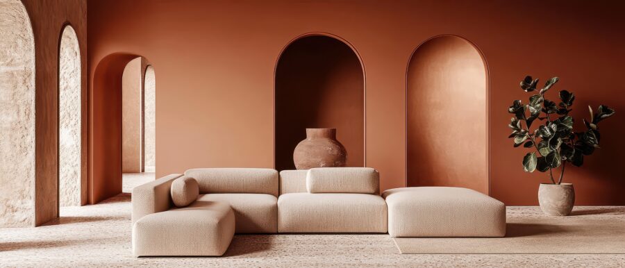
Terracotta Is Having a Modern Moment
We’ve all seen terracotta in its traditional forms — tiles, pots, and warm-weather villas. But right now, it’s showing up in a more refined way. I like to use it to warm up modern spaces that otherwise feel too clinical. In a soft-textured wall, a sculptural ceramic, or a tailored accent chair, terracotta adds soul. It’s earthy, but also unexpectedly chic.
![]()
![]()
![]()
![]()
Mauve Is Moodier Than You Think
People often write off mauve as dated or too sweet — but let me tell you, the right tone can transform a space. I lean toward mauves that are smoky and desaturated. They bring subtle drama, especially in intimate rooms like bedrooms or reading nooks. It’s a sophisticated way to bring colour into a space without overpowering it.
This Is Colour With Purpose
What I love about these shades is their emotional pull. They aren’t just beautiful — they are grounding, soothing, expressive. When chosen intentionally, colour shapes not just the look of a room, but the way it feels to live in.
And that, to me, is what great interior design should always do.
By Christopher de Bod, Christopher de Bod Interior Designs
Contact: Christopher de Bod Designs
Be more Inspired here


You might also like...
-
A Seat in the City

Why public seating shapes how we experience Cape Town’s Inner City Last week, during a deceptively simple question took centre stage: Does the seating in ...
-
Creating comfort for Kingdom Fire Ministries with Alliance

When Kingdom Fire Ministries sought to transform an older industrial warehouse in Stellenbosch into a welcoming place of worship, one of the greatest challenges ...
-
Black Pearl Highlights Curved Forms & Sculptural Furniture: Softening Spaces with Style

Black Pearl highlights a growing movement in interior design that moves away from sharp edges and rigid lines, embracing a softer, more expressive aesthetic through ...
-
King’s College School: A New Landscape of Learning in the Bahamas

King’s College School signals a profound shift in how learning environments are conceived in the Bahamas, embracing a contemporary, climate-responsive, and community-centred design ethos. Conceived ...


Visit SA Decor & Design on social media


