
Purple Love With Pantone Ultra Violet
Inventive and imaginative, Ultra Violet lights the way to what is yet to come. A dramatically provocative and thoughtful purple shade, PANTONE 18-3838 Ultra Violet communicates originality, ingenuity, and visionary thinking that points us toward the future.
Colour of the Year 2018 – Quote from Lee Eiseman: Complex and contemplative, Ultra Violet suggests the mysteries of the cosmos, the intrigue of what lies ahead, and the discoveries beyond where we are now. The vast and limitless night sky is symbolic of what is possible and continues to inspire the desire to pursue a world beyond our own. ![]()
![]()
![]()
![]()
 Enigmatic purples have also long been symbolic of counterculture, unconventionality, and artistic brilliance. Musical icons Prince, David Bowie, and Jimi Hendrix brought shades of Ultra Violet to the forefront of western pop culture as personal expressions of individuality. Nuanced and full of emotion, the depth of PANTONE 18-3838 Ultra Violet symbolizes experimentation and non-conformity, spurring individuals to imagine their unique mark on the world, and push boundaries through creative outlets.
Historically, there has been a mystical or spiritual quality attached to Ultra Violet. The colour is often associated with mindfulness practices, which offer a higher ground to those seeking refuge from today’s over-stimulated world. The use of purple-toned lighting in meditation spaces and other gathering places energizes the communities that gather there and inspire connection. ![]()
![]()
![]()
![]()
 About the Pantone Colour of the Year “The Pantone Colour of the Year has come to mean so much more than ‘what’s trending’ in the world of design; it’s truly a reflection of what’s needed in our world today.” – Laurie Pressman, Vice President of the Pantone Color Institute. As individuals around the world become more fascinated with colour and realize its ability to convey deep messages and meanings, designers and brands should feel empowered to use colour to inspire and influence. The Colour of the Year is one moment in time that provides strategic direction for the world of trend and design, reflecting the Pantone Colour Institute’s year-round work doing the same for designers and brands.
 ![]()
![]()
![]()
![]()
 Source: Pantone


You might also like...
-
Less Is More: Inside LIM’s Tranquil New Claremont Store

LIM’s newest store in Claremont is a masterclass in modern restraint – a serene, light-filled space that embodies the brand’s quietly confident philosophy that ...
-
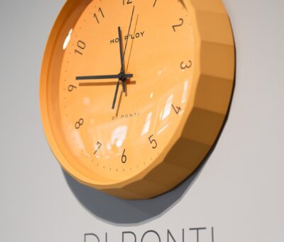
Hoi P’loy Introduces the Di Ponti Clock: A 3D-Printed Timepiece Blending Letterpress Craft and Italian Design Influence

Time is often measured quietly, yet the objects that mark it can carry remarkable presence. With the introduction of the Di Ponti Clock, Cape Town–based ...
-
@home Presents Sage: The Evolution of Breville in South Africa

Trusted kitchen appliance leader Breville transitions to Sage, bringing the same award-winning performance under a refreshed identity. @home, South Africa’s premier destination for stylish and ...
-
Barrydale Hand Weavers: Indoor–Outdoor Blur: Weaving Seamless Living Spaces

As South Africa moves into its sun-soaked season, the boundary between inside and outside begins to dissolve. Homes are increasingly designed to flow ...


Visit SA Decor & Design on social media


