
KARE Design Goes Coral with Pantone
Kare Design is on trend with the latest accessories in Pantone’s new colour of the year 2019.
Like a breath of fresh air, Living Coral is here and is proudly Pantone’s Colour of The Year 2019. Vibrant and warm, this colour hints at the ocean reefs and gorgeous natural tones of the sea – bringing richness and energy to any interior.
Kare Design shows us how to bring this tone into our homes, whether through art on our living room walls, upholstered furniture, vases and more – adding living coral to your home is simple with the right accessories.
The key here it to not overwhelm your home in one central colour. Instead, invest in quality accessories to add accent tones to your space. Living Coral is the perfect accent tone – a beautifully bright and inviting shade, this colour will brighten up and add cheer to any room.
Paired with darker shades such as aqua and navy, Living Coral will infuse your space with richness and drama. You can also add it to lighter shades such as white and beige for a lighter, brighter and cosy environment at home.
Bringing us the latest in international trends, Kare Design shares some of their must-have items in this ravishing tone of the year:
![]()
![]()
![]()
![]()

Shop the look at Kare Design.


You might also like...
-
Love in Every Bite

The Most Memorable Dinners Are Shared at Home Valentine’s Day has a way of reminding us to pause, celebrate the people we adore, and add ...
-
Carrol Boyes Write Your Legacy: Reimagining the Art of Writing

In an age dominated by digital communication, the simple act of putting pen to paper has become something increasingly rare—and all the more meaningful because ...
-
Decor Handles: The Art & Science of Ergonomic Door Handle Design

Every time we touch a door handle, whether at home, in the office, or in public, we experience design in action. But it’s more than ...
-
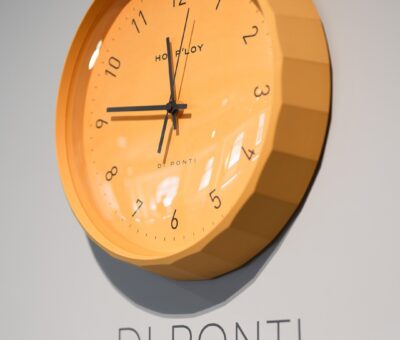
Hoi P’loy Introduces the Di Ponti Clock: A 3D-Printed Timepiece Blending Letterpress Craft and Italian Design Influence

Time is often measured quietly, yet the objects that mark it can carry remarkable presence. With the introduction of the Di Ponti Clock, Cape Town–based ...


Visit SA Decor & Design on social media


