

Linen Drawer: Does Colour Really Affect Your Mood?
Have you ever found yourself feeling antsy in a red room, or serene and relaxed in a blue room? For centuries, artists and scientists have believed that colour has a profound impact on a person’s mood and behaviour.
![]()
![]()
![]()
![]()

Colour psychology, the study of how colour affects mood, is one of the most important factors taken into account by marketers, artists and designers. Whilst colour perception is subjective, and much of our colour perception is determined by our culture, there is no doubt that we are instinctively affected differently by warm and cool colours.
One study showed that warm-coloured placebo pills were reported as more effective than blue-coloured placebo pills, whilst another showed that the colour red causes people to react with greater speed and urgency. In some cities, the installation of blue-coloured street lights had a major impact on reducing crime.
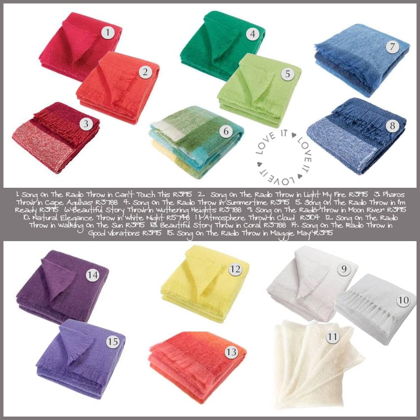
Linen Drawer is a trusted manufacturer and distributor of top quality home textiles, and has a wide variety of products to choose from in all the colours of the rainbow:
Red
Described as warm, passionate and intense, the colour red can evoke feelings of love and warmth, but is also sometimes associated with anger. It is energetic, and is a great colour to use around the home in bursts, especially with white and grey. A pop of red in your office could do wonders for productivity!
Blue
The colour blue is associated with calmness and serenity, and is one of the most popular colours. Though it promotes tranquillity, some also perceive it as cold. There is an association between blue and reliability, which is why major businesses such as financial institutions choose blue for their logo and branding. It is a popular colour for bedrooms and children’s rooms.
Green
Green is associated with nature and the outdoors, and symbolises good luck, health and tranquillity. The colour is often used for relieving stress as it has a calming effect. Studies have shown that when a person is in a green environment, their muscles are more relaxed and their pituitary gland is stimulated (a pea-size structure at the base of the brain that produces critical hormones). The effect is calming and stress-relieving.
Yellow
The colour yellow is attention-grabbing, bright and warm. It is considered the most fatiguing colour to the eye because of the high amount of light that it reflects, so it is best used in small doses around the home or office.
Though it is bright and cheerful, yellow is also linked to frustration. Because of its ability to draw attention, it is a popular choice for notice boards, traffic signs and advertisements.
Purple
The symbol of royalty and wealth, purple also represents wisdom and spirituality. It creates an air of decadence, and is often described as “luxurious”. As such, it’s a lovely colour to incorporate in the bedroom or living room.
Because it’s also seen as a creative stimulant, purple can be used in creative spaces such as art rooms, workshop venues and offices of writers, designers and creatives.
Orange
Orange is considered an energetic colour associated with feelings of excitement and enthusiasm. Because of its attention-grabbing abilities it is a popular colour for branding.
Because orange is prominent in nature (think citrus fruit, sunsets and autumn leaves), it often conjures up feelings of comfort and warmth. Use in bursts around the home.
White
The colour white is traditionally associated with cleanliness and purity. Because of its brightness, white can convey a sense of spaciousness. However, when overused, it can seem sterile and cold. For some, white has a “blank canvas” effect, making them feel inspired. For others, it is bland and unfriendly. We recommend white a base colour, combined with other colours of your choice.
Shop the look here:
![]()
![]()
![]()
![]()
Contact: Linen Drawer


You might also like...
-
Shuttleworth Weaving: Handmade Rugs Crafted in the KwaZulu-Natal Midlands

In the misty hills of the KwaZulu-Natal Midlands, Shuttleworth Weaving continues a practice that feels both ancient and quietly contemporary. Here, rugs are not ...
-
The Mattress Warehouse: Big Purchases, Small Spaces – Rethinking Modern Bed Sizes

You walk into a showroom, spot a magnificent king bed, and immediately picture yourself living your best ‘hotel life’. Completely understandable. But here is the ...
-
Memory Foam Mattresses Worth Buying in 2026 | Expert Guide

If better sleep is on your 2026 bingo card, you’re not alone, and thankfully, it’s one of the easier upgrades to make. Swapping out your ...
-
Storytelling Through Design: Woven Layers, Lived-In Spaces

The most memorable interiors aren’t perfectly styled, they’re deeply personal. They hold traces of the people who live in them, revealing stories through objects, ...


Visit SA Decor & Design on social media


