
Whetstone: Versus Colour of the Month
Welcome the autumn in with this sophisticated Colour of The Month from Versus Paint: #Whetstone.
Whetstone is a gorgeous mossy green with olive undertones, which is one of the best hues to use in a rustic or neutral space.
![]()
![]()
![]()
![]()
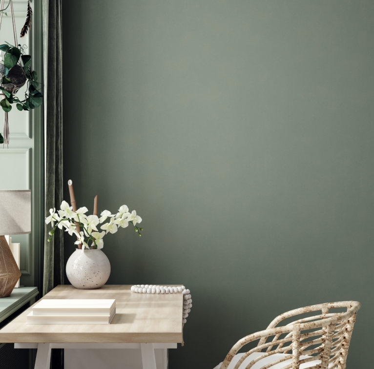
This muted shade symbolises peace, harmony, empathy, and strength, making it a bold focal point in the home.
Whetstone is versatile and pairs well with tan, browns, maroon, pewter, navy, and red.
![]()
![]()
![]()
![]()

Some of the best areas in the home for this shade are the dining room, guest bathroom, entrance hall and lounge. Whetstone is also the perfect shade to use as the fireplace feature wall, creating a warm, balanced focal point in the room.
![]()
![]()
![]()
![]()

Get the #VersusColourOfTheMonth online from www.versuslifestyle.com
These paints are also available from Versus Paint Direct Wynberg and Leroy Merlin South Africa
Proud sponsors of Decorex Africa
#Versus20yrs #VersusPaint #Paint #ColourTrends #HomeDecor #ImagineWhatWeCanDoForYou #ItsALifestyle #PaintTrends #HomeDecor #HomeInspo #HomeGoals


You might also like...
-
Introducing Doshi Retreat

Set within the renowned Vitra Campus in Germany, the Doshi Retreat is a powerful new architectural intervention that invites stillness, reflection, and sensory awareness. Designed ...
-
The Home Channel: December 2025 Highlights

This December , tune in to The Home Channel for a curated lineup of the finest in interior design, lifestyle trends, and home viewing inspiration. ...
-
Step into The Majestic Dzombo Safari Lodge

If safari stays could have a personality, Dzombo Lodge in the Black Rhino Private Game Reserve would be that effortless, joyful guest who makes everyone ...
-
Cloud Dancer Named Pantone’s Color of the Year 2026, Symbolising Stillness and Imagination

Pantone has unveiled its Color of the Year for 2026: PANTONE 11-4201 Cloud Dancer, a soft, billowing white that captures a growing collective longing ...


Visit SA Decor & Design on social media


