Spotlight on Plascon’s Golden Yellow: Beeswax Candle
Put a big smile on your face this Winter with joyful, happy-go-lucky yellow. You can’t really go wrong with the colour of the sun in your home but there are a few tricks to follow to make sure it doesn’t feel like you’ve just landed on Mercury.
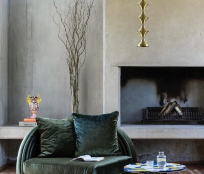
Plascon’s sumptuous golden yellow Beeswax Candle (Y1-B1-1), part of their 2019 Colour Forecast’s Luxury colour story, is an autumnal hue reminiscent of the mid-century period. Used in just the right amount, it’s perfect for a sunny, grown up interior.
The energy of primary blue Winter Storm (B3-B1-2) juxtaposed with textural dark and metallic accessories speak of balance, focus and masculine authenticity.
Plascon’s Head of Decorative Marketing, Katlego Kondlo says, “Yellow has the power to brighten a dark space and warm up a cool room. It can be overpowering so be sure to use it in small doses for maximum effect.”
Luxury’s colours are rich and sophisticated featuring grounded natural colours like aubergine, amber, tomato red and pistachio green. It’s also the home of Ravine (62), Plascon’s versatile neutral of the year. Katlego says, “This palette is perfect for lavish interiors. Comfort and sophistication work hand in hand to create calm refuges from your busy day and there’s more than one way to achieve this look.”
Yellow works well with contrasting colours. For an elegantly luxurious space, updated mid-century shades like Black Bean (71) and Beeswax Candle provide a refined colour clash in traditional schemes. Getting on trend with new paint techniques, frame your view by painting it on window and door frames and keep it grounded with deep purple Dark Antelope (P7-E1-1). “Looking through a colourfully painted frame completely changes your perspective on things. The overall effect is an intimate interior which oozes luxury and poise. It’s perfect for the cooler months!” states Katlego.
Upbeat luxury ensues with a playful combination of dramatic Burnt Horizon (R7-B1-1) and gilded Beeswax Candle (Y1-B1-1). Red as the core colour is confident and evokes a person with a love of heritage.
Looking to change things up with an upbeat style? Consider combining Beeswax Candle with dramatic reds and blues. Mix a touch of Beeswax Candle with dramatic red Burnt Horizon (R7-B1-1) and playful blue Winter Storm (B3-B1-2) and you have a buoyant colour scheme. Katlego says, “Get an understated, sophisticated look by combining it with the clean, uncluttered lines of mid-century furniture and design. You can also up the style stakes with our Double Velvet interior paint for a hard wearing, luxurious finish.”
Luxury with a masculine edge awaits when brooding colours such as Black Bean (71) are enlivened with primary blue Winter Storm, Ravine and the smallest doses of Beeswax Candle. “Try offsetting these colours with metallic décor accessories with unusual lines to get a balanced look that spells masculine confidence,” says Katlego.
The optimism and cheerfulness that yellow produces in your home is just golden and Beeswax Candle brings this look along with a unique sense of luxury and style. Katlego concludes, “Beeswax Candle is your go to yellow for a refined pop of colour. Combining it with other colours from the Luxury palette will give you an old world look and feel that is packed with style, perfect for Winter.”
Updated mid-century shades such as regal Black Bean (71) and autumnal Beeswax Candle (Y1-B1-1) provide a refined colour clash in traditional schemes.
For more visit Plascon.
You might also like...
-
Choosing the right subtrates for Float Concrete Wall Panels

Installing Concrete Wall Panels starts with one essential detail: the surface they’re fixed to. The substrate is the foundation, vital for strength and lasting longevity. ...
-
Top Interior Design Trends for 2026: Warmth, Craftsmanship, and Personal Spaces

Every year, Marcia Margolius, Head of Content for SA Décor & Design and one of the country’s most trusted design experts, shares the looks, ...
-
Scents of Style: How Fragrance and Candle Design Are Defining Interiors in 2026

In the world of interior design, the senses are making a comeback — and nowhere is this more evident than in the rise of home ...


