
Say Hello To The Plascon Colour Forecast 2019
Each year it is Plascon’s great pleasure to put together and share their comprehensive Colour Forecast. It empowers you to decode the world of colour and make it relevant to your spaces, life stages, personal taste and sense of style.
![]()
![]()
![]()
![]()
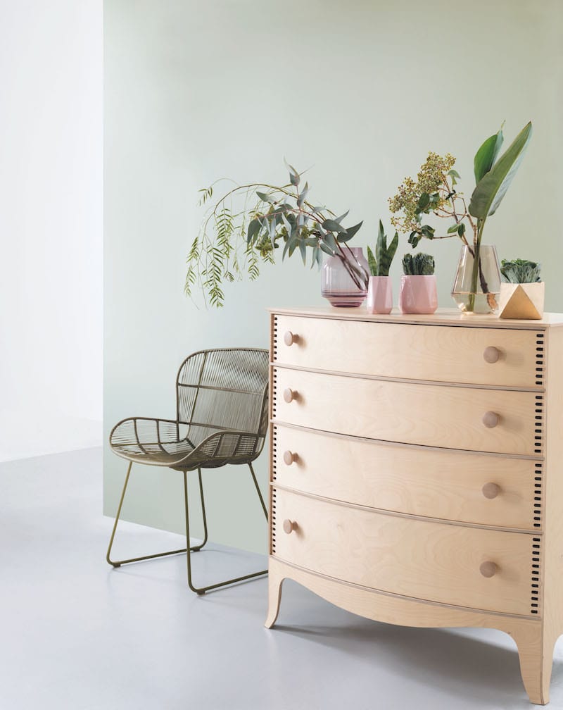
 Colour is so much more than the paint we roll onto our walls. The way we use colour tells the world our most personal stories and acts as a mirror of the things that mean the most to us.
In preparation for the 2019 Colour Forecast, Plascon embarked on a Kansai Paint Colour Workshop with team members from around the world. This was undertaken together with WGSN, a global trend authority, who helped Plascon to collaboratively develop insights around colour, interior and lifestyle shifts. With their big picture trend filter and Plascon’s local customer understanding, they then worked together to develop the outcomes into four definitive colour stories for the coming year.
Introducing The Neutral of the Year 2019
![]()
![]()
![]()
![]()
 Plascon’s Neutral of the Year is Ravine 62, an artful blend of grey and beige. It’s the perfect
shade on which to base your signature colour palette, regardless of your personal style preferences.
Plascon’s Glamour Story
![]()
![]()
![]()
![]()
 Femininity makes a statement when modern pastels like Nutmeg Dust are paired with gold accents and a pop of saturated pastel green in Granny Apple.
This is Plascon’s Glamour Story. Underpinned by the elegant and restrained neutrals, Oyster Catcher and Nutmeg Dust, the Glamour Story is brought to life thanks to the addition of accent shades such as Groovy Grape.
![]()
![]()
![]()
![]()
 Plascon’s Luxury Story
Mid-century shapes and tones are given a modern makeover in velvet finishes and updated colours, like Winter Storm and Golden Lake.
![]()
![]()
![]()
![]()
 Luxury’s colours take their inspiration from old-world values. Shades from the mid-century period, such as Beeswax Candle and Golden Lake, are softened, giving them a soothing quality while deep purple, such as Dark Antelope, retains its sense of drama.
![]()
![]()
![]()
![]()
 The Minimal Story
Uncluttered ultra-modern spaces benefit from the addition of unexpected pops of colour, such as Go Go Red. Futuristic neutrals like Daiquiri Cream are at the core of this minimal palette, which appeals to those who love a modern look that is uplifted by hues drawn from nature such as Lemon Rind and fruity Orange Delight.
![]()
![]()
![]()
![]()
 The Urban Story
Vibrant accent colours in petrol-green, Golf Greens and rich cobalt, Pristine Blue, gives our urban colour palette serious street cred. True to its industrialist heart, this colour story is underscored by cementitious Silver and gritty Bovine. When paired with Golf Greens or Pristine Blue, it gains a sports-luxe familiarity that softens the overall look. Intense red, such as Red Flame, and rich purple, Victorian Lace, enrich this vibrant palette when introduced as accent shades.
![]()
![]()
![]()
![]()
 For more visit Plascon.


You might also like...
-
Give Your Home an Autumn Comfort Makeover with Slumberland

As autumn arrives and the temperatures begin to dip, many homeowners start thinking about an autumn comfort home makeover. Our homes naturally become the place ...
-
Embracing Autumn Interior Design Ideas: Warm Textures & Restorative Spaces

Interiors are starting to mirror the rhythm of the season — softer light, richer tones, and a deeper sense of comfort. Deco Surfaces has observed ...
-
Exciting New Shows Coming to The Home Channel in January 2026

The Home Channel is kicking off January 2026 with a fresh slate of exciting, brand-new programming designed to inspire, entertain, and delight viewers. Leading the ...
-
Season’s Greetings from Our Design Family

As the festive season glimmers into view, we pause to celebrate another year of design, creativity, and inspiration—with you at the heart of it. Your ...


Visit SA Decor & Design on social media


