
Plascon: Shades of Autumn to Cocoon Your Home
The people have spoken! Cocoons of rest and rejuvenation are what we want from our homes these days. A place where emotional comfort is granted as you walk through the front door. Plascon’s Luxury colour story from their Colour Forecast 2019 provides the ideal palette to achieve this look and feel and it’s perfect for welcoming the Autumn months too.
The concept of luxury takes a new direction with the Luxury colour story. No longer associated with the more is more concept, it instead extends to a renewed appreciation of life’s simple pleasures. “Undeniably grown up, this look takes us back to a slower pace of life where old world values take centre stage. Imagine a calm reading nook or a soothing bathroom, a home where you can catch your breath is what Luxury aims to achieve,” says Plascon Head of Decorative Marketing Katlego Kondlo.
![]()
![]()
![]()
![]()
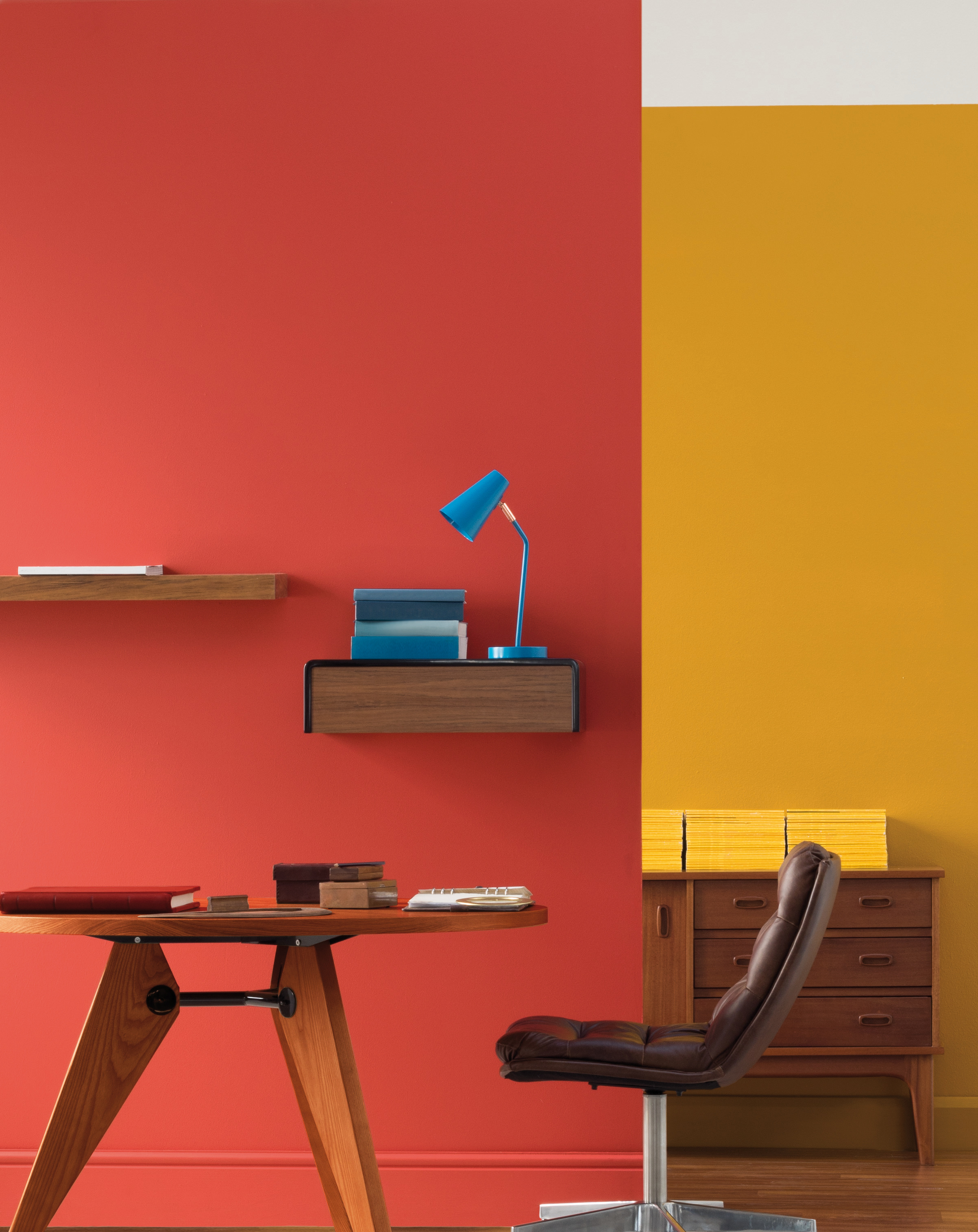
Luxury’s autumnal colours are at once harmonious, sumptuous and youthful taking their inspiration from shades of the mid-century period, that design era of clean lines and uncluttered spaces that continues to be so popular now. Feature colours include rich gold Beeswax Candle (Y1-B1-1), Golden Lake (Y5-C1-3) and dignified Black Bean (71) while cobalt blue Winter Storm (B3-B1-2), deep purple Dark Antelope (P7-E1-1) and burnished red Burnt Horizon (R7-B1-1) add the pops of colour as accents. Katlego says, “Berry Good (P1-A2-3) and Ravine (62), our neutral of the year, are the neutrals which provide a soothing backdrop for this colour scheme. The other six colours, including blues, reds, yellows and browns, give mid-century designs a modern look whether you’re going for an elegant, upbeat or authentic look.”
Dark interiors are here to stay and are great for getting that cosy feeling in the cooler months without compromising on sophistication. In a kitchen opt for dark brown Black Bean on walls, floors and doors offsetting it with wooden accents and shiny copper fittings to avoid it being too brooding.
![]()
![]()
![]()
![]()
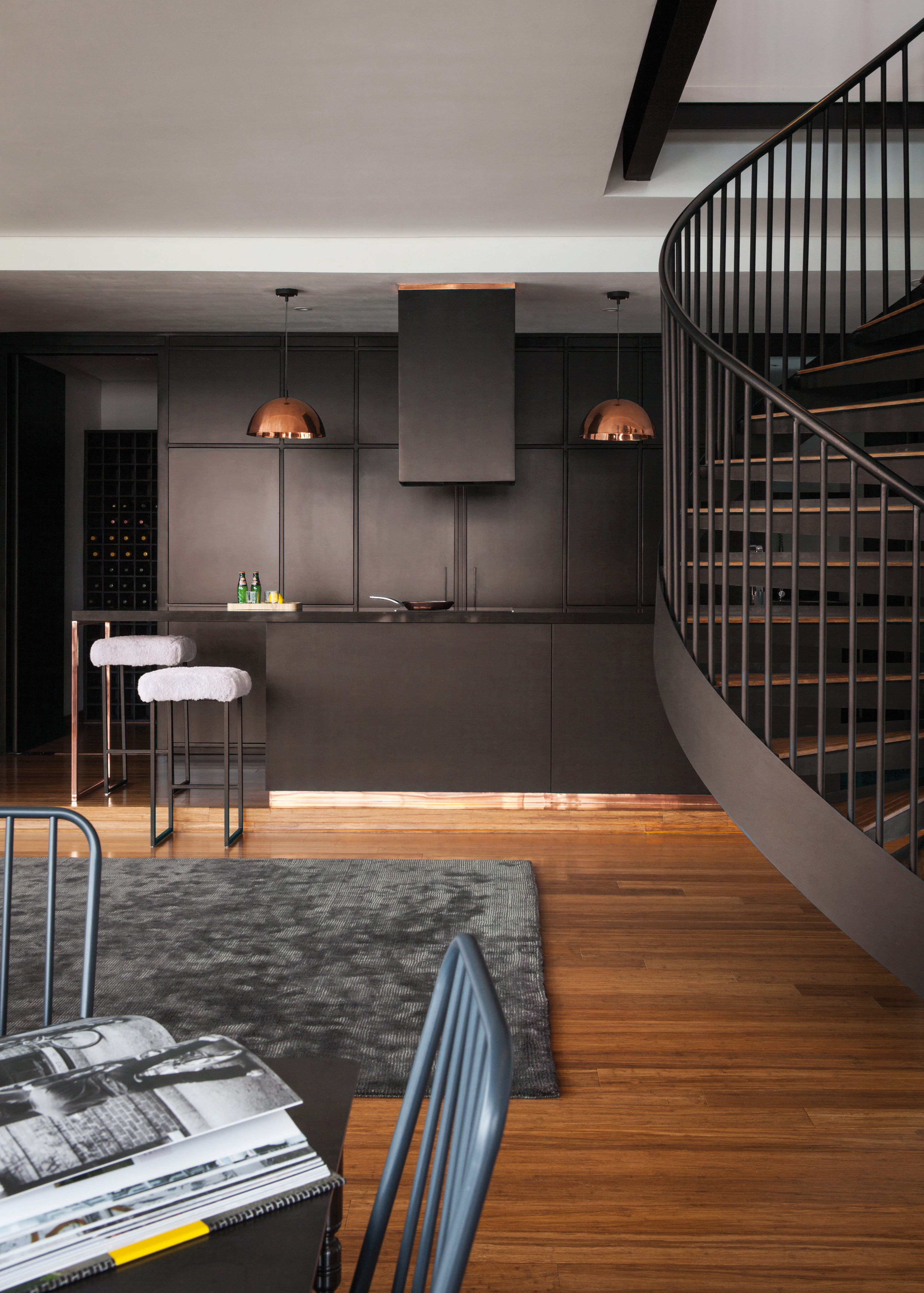
Part of the Luxury palette, neutral of the year Ravine (62) is an artful blend of beige and grey and creates a versatile backdrop for just about any décor scheme. While the popularity of dark spaces gathers momentum, the Scandi look never seems to die and Ravine (62) is the perfect neutral to achieve this timeless aesthetic. Paired with bright whites and blonde wood tones it creates that clear and calm Scandinavian feel but it can also be used with bold Black Bean, Beeswax Candle (Y1-B1-1) and Winter Storm (B3-B1-2) for a masculine yet authentic look. “I also see it in the classically decorated home with layers of similar neutrals for a cosy French Provence look. And using Plascon’s premium quality Cashmere or Double Velvet paints will up the plush stakes with their luxurious finishes,” Katlego says.
Luxury’s colours will take you back to laid-back style without the need for too much else. It’s a look that promotes well-being and introspection. Katlego settles it, “The rich colours paired with great design from the mid-century era will leave you with a space poised for reflection and relaxation whether it’s in your kitchen, lounge or bedroom.”
![]()
![]()
![]()
![]()

For more visit Plascon.


You might also like...
-
Silk by Design: Elegant Wedding Flower Ideas

Flowers play a powerful role in setting the tone for a wedding. They frame the ceremony, elevate reception tables, and create those memorable visual moments ...
-
Why Preventive Measures Matter in Long-Term Home Pest Control

Keeping a house clean and safe requires more than just reacting to problems when they appear. Preventive care focuses on stopping infestations before they ...
-
Introducing Doshi Retreat

Set within the renowned Vitra Campus in Germany, the Doshi Retreat is a powerful new architectural intervention that invites stillness, reflection, and sensory awareness. Designed ...
-
Embracing Autumn Interior Design Ideas: Warm Textures & Restorative Spaces

Interiors are starting to mirror the rhythm of the season — softer light, richer tones, and a deeper sense of comfort. Deco Surfaces has observed ...


Visit SA Decor & Design on social media


