
Plascon’s colour stories 2017
Colour is not just a part of life. It is life. It’s how we express ourselves, it influences our mood and it helps us to understand our world. Plascon relates to that sentiment and that’s why they feel the need to publish the latest colour trends in their annual Colour Forecast. Use this as a guide for your space as it rounds up all the trends for 2017.
![]()
![]()
![]()
![]()
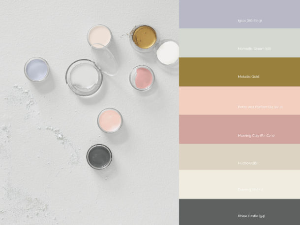
 This year’s themes are influenced by the attraction we feel for both the digital and natural worlds. This seemingly contradictory pair is very much a metaphor for who we are as people at the moment and the use of colour is more pure and single-minded. Here are Plascon’s colour stories:
Anonymous
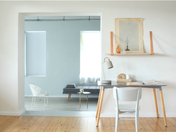
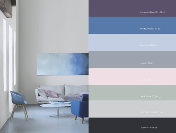
This is all about the freedom you get when you strip right back to basics and embrace the softer things in life. It’s a new kind of neutrality – beyond a specific gender, identity, place or even style. This approach embraces simplicity and is a response to how oversaturated our lives feel because of all the things that surround us in the world. Expect to see a palette of light blues, green and pinks with deep purple, blue and black. Metallic-inspiredshades complete the look and add a sense of depth to the theme. These colours are soothing and calm, giving us space to pause in a busy world. ![]()
![]()
![]()
![]()
 Terrain
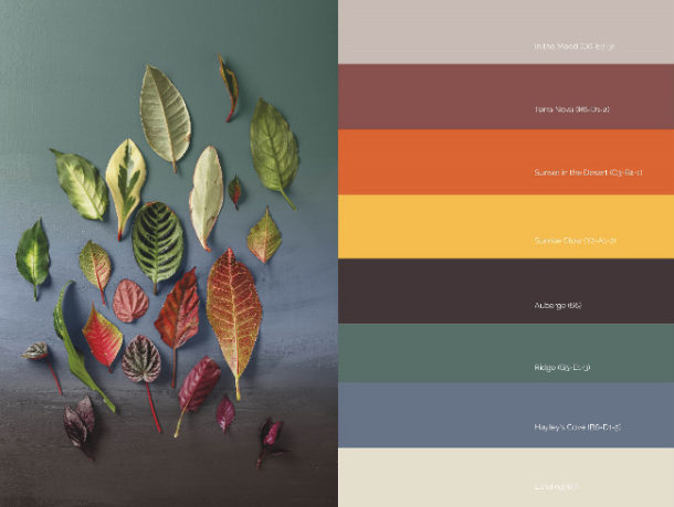
This earthy theme is inspired by desert landscapes and colours. It takes the raw forms of these places and interprets them into a warm and easy-to-use palette made up of oranges and yellows balanced by warm neutrals and a mineral green and blue duo. Pop up the use of yellows, oranges and dull them down with greys and neutrals. Natural is a heaven sent. ![]()
![]()
![]()
![]()
 Prism
Prism
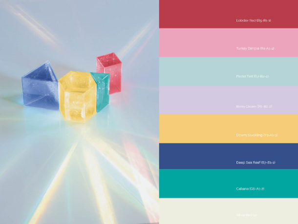
Vibrant and contemporary, this theme is inspired by digital art and features layers of colour being used to create a sense of depth. Using prism-inspired and scattered geometric effects on walls, along with prospective designs, contrast is key. ![]()
![]()
![]()
![]()
 Pause
Pause
This sophisticated neutral look. embraces feminine blush shades as well as grey and blue-tinted updates on classic beiges. This all helps to create a sense of depth and create a minimalism that is anything but boring. ![]()
![]()
![]()
![]()
 Read more here Contact: Plascon


You might also like...
-
Embracing Autumn Interior Design Ideas: Warm Textures & Restorative Spaces

Interiors are starting to mirror the rhythm of the season — softer light, richer tones, and a deeper sense of comfort. Deco Surfaces has observed ...
-
Scents of Style: How Fragrance and Candle Design Are Defining Interiors in 2026

In the world of interior design, the senses are making a comeback — and nowhere is this more evident than in the rise of home ...
-
What Causes Lithium-ion Battery Fires?

Where There’s a Spark, There’s a Flame. Behind the convenience of lithium-ion batteries lies a potentially hazardous science. SafeQuip, a leading distributor of fire-related equipment, ...
-
Why Preventive Measures Matter in Long-Term Home Pest Control

Keeping a house clean and safe requires more than just reacting to problems when they appear. Preventive care focuses on stopping infestations before they ...


Visit SA Decor & Design on social media


