
Get Cheerful with Plascon’s Hooray
It’s October and as we inch our way towards the festive season, say ‘HOORAY!’ with Plascon’s fluorescent pastel orange, Hooray (O3-A1-3). Muted yet fun and vivid colour, Hooray shares red’s energetic, positive and playful nature and is the perfect hue to get you in that ‘kick off your heels and grab a Pimms’ type of mood.
![]()
![]()
![]()
![]()
 Following on from a previous colour of the month, Hot-n-Spicy, Hooray falls into Plascon’s Inspired Orange collection. Not intense like red, this far from timid hue is essentially a bright pastel, pinky orange. Plascon Colour Specialist and Media Stylist, Kerstin Eser says, “We think Hooray is the perfect colour to say hello to the festive season as it adds excitement and cheerfulness to any palette, space or fashion accessory.”
![]()
![]()
![]()
![]()
 The Power of Orange
Orange burns with intensity yet doesn’t scorch the way red does. Even though it is a ‘hot’ tone, it is not as forceful as red and has a little more depth than yellow. Kerstin says, “Autumnal orange speaks to change and movement and is a great colour to introduce when you are experiencing change or need to encourage change.”
Orange’s different shades are also strongly linked to creativity and you’ll often see it in the communal spaces where creatives work. As said on 99design.com ‘positive associations that typically come along with orange include affordability, beauty, earthiness, energy, enthusiasm, friendliness, health and vitality, playfulness, seasonal changes and warmth’.
![]()
![]()
![]()
![]()
 All about Hooray
Hooray is a true orange. On Plascon’s colour chart, it sits closer to red than yellow, which means it has more red in it to give the colour its retro neon pastel appeal. Related to the deeper shade, Tangerine Tango (O3-A1-1), Hooray is still considered to have a bright chroma.
How to use Hooray in your space
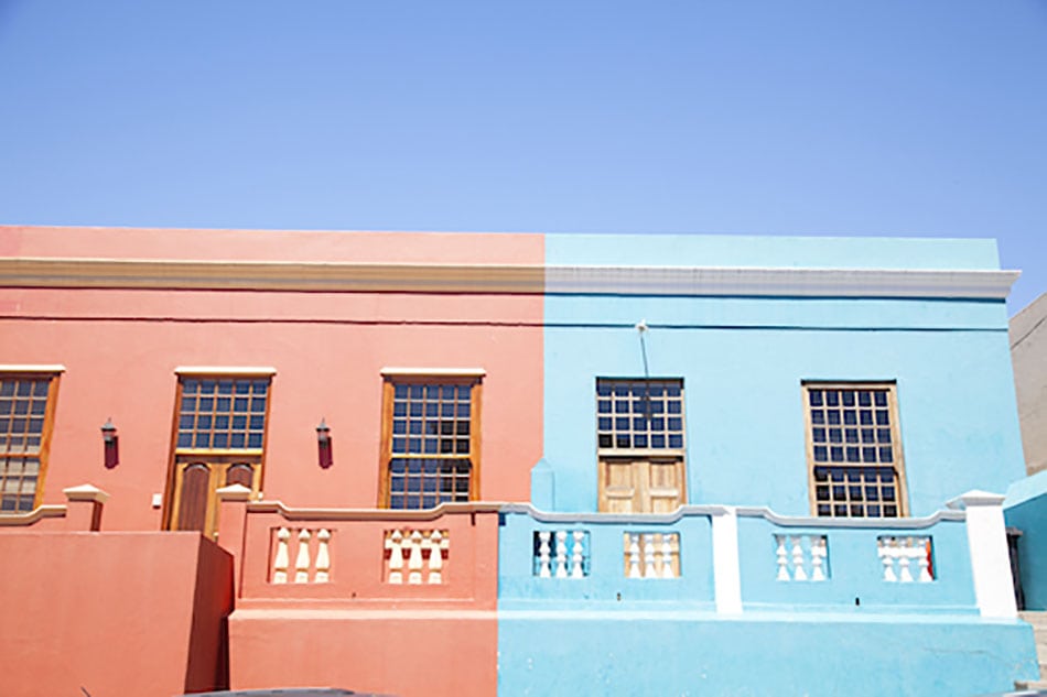
Use Hooray’s analogous or related colours on either side of the colour wheel to create a dynamic colour combo that is fresh, inviting, contemporary and super energetic. Complementary colours would be blues like Monet Magic (B3-A1-1) or Blue for You (B3-A1-3). Match them up and, yikes, we have a brave and bold combo.
Hooray’s adjacent colours, would be a yellow like Summer Memory (Y2-A1-3) or a purply red like Valentine Rose (R2-A1-2). Put them together and we have another daring combination that will put a spring in your step and some pep to your day.
Kerstin says, “You can also take it back to basics by pairing Hooray up against a white or a soft clean grey backdrop to create a soothing yet energizing statement in a bedroom, lounge or dining area.” And in keeping with serenity, subtly mix touches of Hooray with dusty pink and soft steely blues for a calm but contemporary look.
Kerstin concludes, “Hooray is the kind of colour that, to a lesser degree, shares red’s energising appeal by adding exciting energy to a space or design. This colour is far from shy whether it’s used sparingly or without restraint. So, take the plunge and renergise your space with exciting Hooray!”
![]()
![]()
![]()
![]()
 For more visit Plascon.


You might also like...
-
Silk by Design: Elegant Wedding Flower Ideas

Flowers play a powerful role in setting the tone for a wedding. They frame the ceremony, elevate reception tables, and create those memorable visual moments ...
-
Shedding Light on Your Next Shoot at Die Handelshuis, Paarl

If you’re searching for a Cape Winelands shoot location that beautifully balances rustic charm with refined elegance, Die Handelshuis in Paarl is a true gem. ...
-
Give Your Home an Autumn Comfort Makeover with Slumberland

As autumn arrives and the temperatures begin to dip, many homeowners start thinking about an autumn comfort home makeover. Our homes naturally become the place ...
-
Why Preventive Measures Matter in Long-Term Home Pest Control

Keeping a house clean and safe requires more than just reacting to problems when they appear. Preventive care focuses on stopping infestations before they ...


Visit SA Decor & Design on social media


