
Dulux’s Colour of the Year 2022… A Breath of Fresh Air
Dulux has revealed the Colour of the Year 2022, an airy, light blue that’s fresh, open, and good for the soul.
The colour is called Bright Skies™, which reflects the limitless skies around us, it brings a hint of the natural world inside and can breathe new life into any space.
![]()
![]()
![]()
![]()

After a spell of feeling shut in, people are craving expansion: the great outdoors, the open air, a sweep of limitless sky – a feeling of release and revitalisation with a breath of fresh air.
Extensive global trend research conducted by a team of in-house paints and coatings colour experts and international design professionals revealed that there was a need for open air, connections to the great outdoors and a fresh approach to everything.
![]()
![]()
![]()
![]()

![]()
![]()
![]()
![]()

Many events over the past two years have thrown the social, economic and environmental aspects of our lives into sharper focus. We’re reassessing what really matters: family, friends, home, and the world around us.
![]()
![]()
![]()
![]()

“In 2022, Bright Skies™ will help us embrace new ideas and shape a new future,” says Heleen van Gent, Creative Director of AkzoNobel’s Global Aesthetic Center. “The colour reflects the limitless skies above us, giving us the space to redefine the role of our homes, nature, the arts and new voices in our lives. As consumers look to express themselves and transform their spaces, our aim as colour experts is to inspire their colour confidence.”
“A light and optimistic shade, Bright Skies™ is a perfect way to bring a breath of fresh air into any room. It’s also incredibly versatile, working alongside four different complementary palettes to give any room an instant sense of light and space, no matter the size. The palettes make it easy to choose and combine an array of soft neutrals and joyful hues. They can be used to define zones in multipurpose spaces, bring a sense of nature indoors, create a soothing atmosphere or encourage a sense of unity,” says Dulux colour expert Palesa Ramaisa.
![]()
![]()
![]()
![]()

The four CF22 palettes: The colours that bring Bright Skies™ to life:
WORKSHOP COLOURS (KALEIDOSCOPE HUES)
Multicoloured and joyful, this light, bright palette is perfect for reinventing the home, and zoning a multipurpose, do-it-all space. Positive and complementary, these tones make the functional fun.
GREENHOUSE COLOURS (FRESH NATURALS)
Made up of fresh greens, greys and blues, this palette can make any room feel in touch with the natural world. These are colours that bring in the positive effects of nature to create a vital space.
![]()
![]()
![]()
![]()
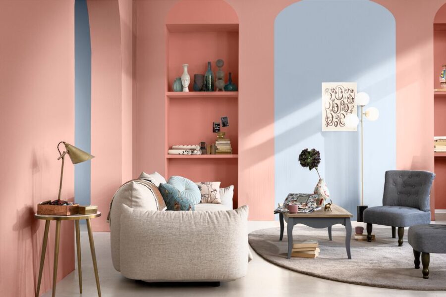
STUDIO COLOURS (CONSOLING TONES)
Pale pinks, reds and oranges, these warm, consoling shades can help turn any space into a soothing sanctuary. Subtle and inspiring, they can help us recharge and escape the everyday.
SALON COLOURS (AIRY NEUTRALS)
Comprising soft whites and light neutrals, this palette can help create the perfect blank canvas. Fresh and unifying tones, they can help create an open space and a home that’s ready for anything.
![]()
![]()
![]()
![]()

For more visit DULUX.


You might also like...
-
Owloon – The Perfect Hideaway in the Cape Winelands

Cradled in the heart of the Cape Winelands, Paarl is a town that seems to shimmer beneath its iconic granite mountain, glowing pink and ...
-
Exciting New Shows Coming to The Home Channel in January 2026

The Home Channel is kicking off January 2026 with a fresh slate of exciting, brand-new programming designed to inspire, entertain, and delight viewers. Leading the ...
-
Scents of Style: How Fragrance and Candle Design Are Defining Interiors in 2026

In the world of interior design, the senses are making a comeback — and nowhere is this more evident than in the rise of home ...
-
Step into The Majestic Dzombo Safari Lodge

If safari stays could have a personality, Dzombo Lodge in the Black Rhino Private Game Reserve would be that effortless, joyful guest who makes everyone ...


Visit SA Decor & Design on social media


