
The Colour psychology of a home
Apartment Therapy is a big believer that colour has an impact on our emotional state, and while there are no set rules for which hue belongs in which room, the one you choose should match the tone you’d like to set. Is the kitchen your solo space to cook and meditate? Go with soft, soothing pastels. Is it your entertainment zone? Give it some life with bright berry red. Here are some of their tips about how to get the best colour for each space:
Entryway
If you want to celebrate more: Introduce pops of unexpected color—here, in the form of friendly orange polka dots—to put your guests into party mode the second they walk in. If you want an easygoing entrance: Use neutral grays and whites. In a foyer that leads into color-saturated spaces, the contrast will draw visitors into the next room. ![]()
![]()
![]()
![]()
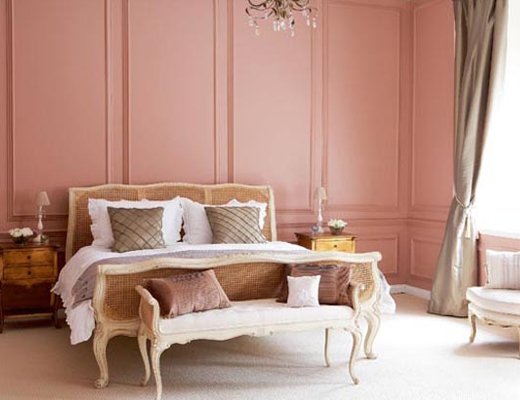
 Bedroom
If you want to unwind: A dusty rose boudoir is both relaxing and romantic. If you want more drama: Search for bedrooms in dark gray and navy. ![]()
![]()
![]()
![]()
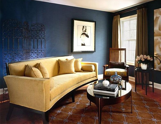
 Living Room
If you want to keep the peace: Brush on a soothing and sophisticated navy blue. If you want more whimsy: Opt for playful pink or orange paint. ![]()
![]()
![]()
![]()
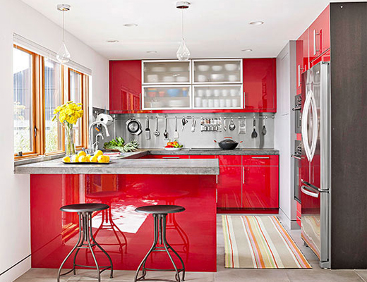
 Kitchen
If you want to add some spark: Vibrant red energizes a kitchen that’s typically a hub of activity. If you want more tranquility: Look for pale shades of blue or mint green. ![]()
![]()
![]()
![]()
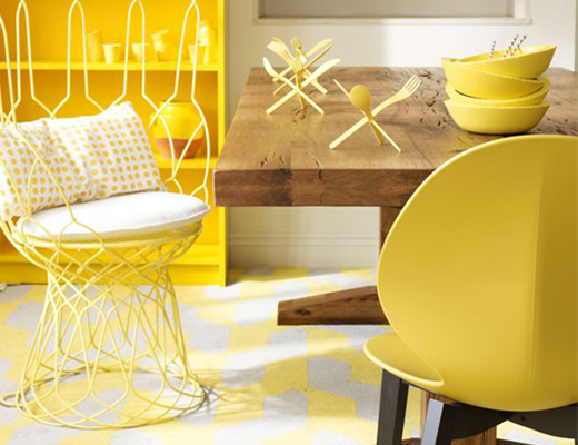
 Dining Room
If you want to smile more: Sweep the room in a sunny yellow. If you want more elegance: Pick rich plums and pinks. ![]()
![]()
![]()
![]()
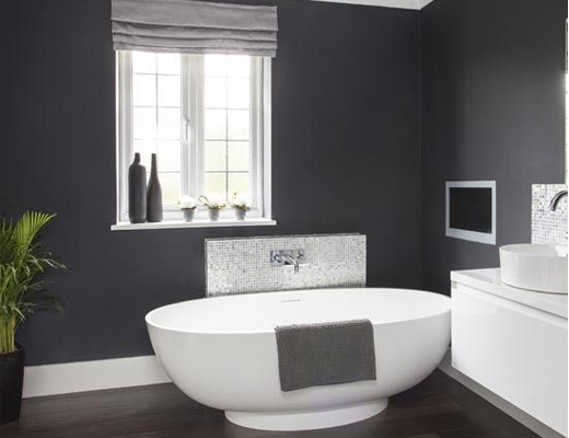
 Bathroom
If you want to keep calm: Go for a subtle gray, which lends a soothing spa-like ambience to this powder room. If you want more coziness: Create bathrooms in rich, warm hues. ![]()
![]()
![]()
![]()
Shopping Guide visit Plascon


You might also like...
-
&Beyond Phinda Vlei Lodge: A Refined Luxury Safari Retreat in KwaZulu-Natal

There are places that announce themselves, and then there are those that unfold slowly, revealing their character over time. &Beyond Phinda Vlei Lodge has ...
-
What Causes Lithium-ion Battery Fires?

Where There’s a Spark, There’s a Flame. Behind the convenience of lithium-ion batteries lies a potentially hazardous science. SafeQuip, a leading distributor of fire-related equipment, ...
-
Perfect Hideaways: Discover Thuúla Haven in the Hemel-en-Aarde Valley

There are few places where time seems to move quite as gently as the Hemel-en-Aarde Valley. Surrounded by rolling vineyards, rugged mountain ranges and flourishing ...
-
Scents of Style: How Fragrance and Candle Design Are Defining Interiors in 2026

In the world of interior design, the senses are making a comeback — and nowhere is this more evident than in the rise of home ...


Visit SA Decor & Design on social media


