

Victoria + Albert: A Collab With Wallpaper Magazine
Modern Movements In Colour…
Architecture styles of the 20th century inspired the new collection of colour palettes by Wallpaper* and Victoria + Albert. Editor-in-chief Sarah Douglas looked to the tonal ranges employed by Belgian minimalists, the splashes of primaries in Brazilian modernism and the colour-popped chromatics in American postmodernism, adapting and reimagining shade and hue for the contemporary bathroom environment. The result is a journey into modern ‘bathitecture’.
“Bathrooms are sanctuaries; extremely personal spaces where you need to feel calm and serene. These colour palettes were influenced and inspired by architecture and the sculptural forms of the Victoria + Albert designs.” Sarah Douglas, Editor-in-chief, Wallpaper*
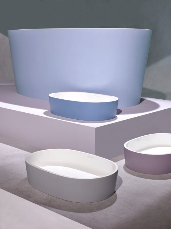
Belgian Minimalism
This subtly nuanced palette creates a gentle ambience across a bathroom.
Referencing the Belgian minimalist movement in design and architecture, this subtle colour palette is inspired by the works of architects Leon Stynen and Juliaan Lampens. Incorporating cool, calm, soft colours – light blues, linen-like pastels, stone and slate greys – the tonal range of the Belgian Minimalism palette references raw and untreated materials. Furthermore, it has a minimising, focusing effect. By removing attention from objective form and turning attention to the essence of the surrounding environment, this subtly nuanced palette creates a gentle ambience across a bathroom.
View the full palette here.
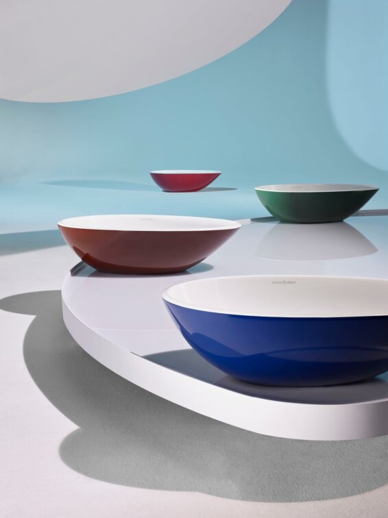
Brazilian Modernism
A thrilling, pioneering movement in contemporary South American architecture and design informs the Brazilian Modernism palette.
Referencing the work of mavericks Lina Bo Bardi, Paulo Mendes da Rocha and Oscar Niemeyer, the Victoria + Albert and Wallpaper* Brazilian Modernism spectrum comprises rich, deep colours – greens, earth tones, glass-brick blues – as well as concrete and translucency. Bo Bardi’s combination of brightness and brutalism was an inspiration – particularly the Italy-born innovator’s use of red accents and architectural detail breaking out of large areas of industrial grey concrete that introduces contemporary, graphic playfulness to the smooth rendered mass.
View the full palette here.
![]()
![]()
![]()
![]()
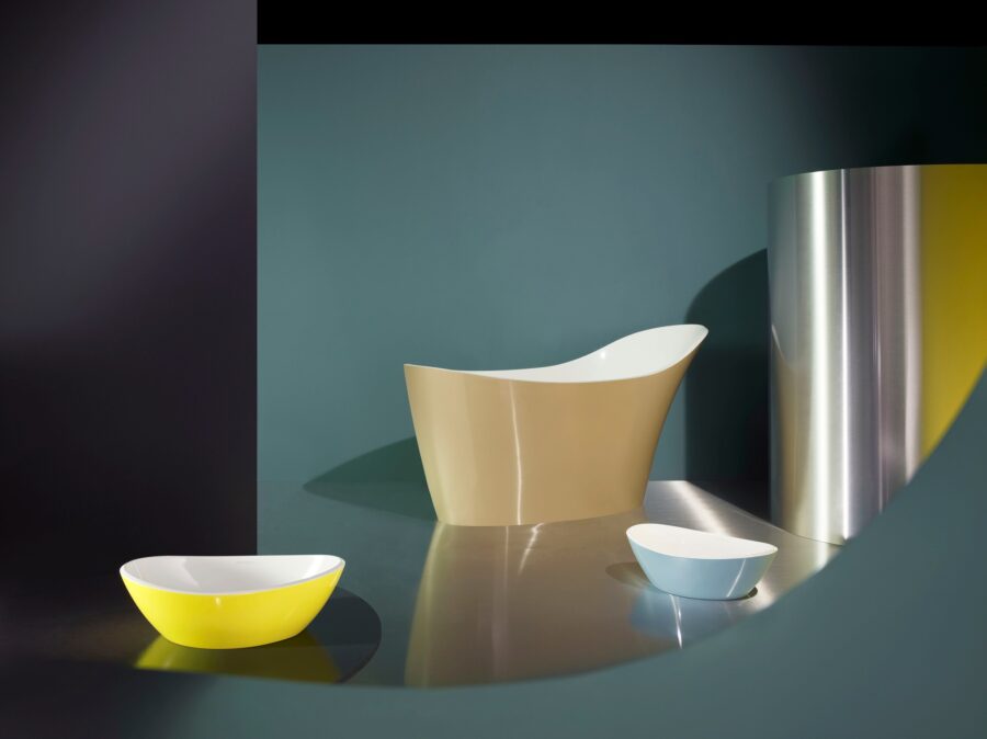
American Postmodernism
A palette that is confident, industrial, dramatic, and fearlessly contrasting.
The work of Frank Gehry, Philip Johnson, Michael Graves, Robert Venturi and Denise Scott Brown – the pluralism, irony, paradox and contextualism of American postmodernism – all contribute to a palette that is confident, industrial, dramatic, and fearlessly contrasting. Think monochromatics with pops of colour – steel, graphite, grey, black, with soft gold, green glass. America’s postmodernist buildings embrace colour like no other architectural movement, giving façades variety and personality through the deployment of coloured glass, ceramic tiles, or stone – an aesthetic sensibility that can be adapted and applied to the bathroom.
View the full palette here.
![]()
![]()
![]()
![]()


You might also like...
-
Bathroom Trends 2026: Warm, Expressive Design Meets Crafted Calm

In 2026, bathroom design embraces boldness, contrast and refinement, allowing each space to express a distinctive personal signature. Design brands and international platforms point to ...
-
The new round Silestone sink that will revolutionise your bathroom

The bathroom has evolved beyond its purely functional origins to become a true sanctuary of wellness and design. Today, every detail matters in creating an ...
-
Italtile’s Exclusive Mirrors: Elevating Style and Spaciousness in Luxury Bathrooms

In a successful luxury bathroom renovation, every element is planned to evoke calm and sophistication. High-end mirrors are not only practical and aesthetically pleasing — ...
-
Transforming Your Home Bathroom into a Spa with Porcelain Stoneware

At a time when personal wellbeing is becoming more and more central to interior design, the bathroom is acquiring a new role too: not just ...


Visit SA Decor & Design on social media


