
Get Cheerful with Plascon’s Hooray
It’s October and as we inch our way towards the festive season, say ‘HOORAY!’ with Plascon’s fluorescent pastel orange, Hooray (O3-A1-3). Muted yet fun and vivid colour, Hooray shares red’s energetic, positive and playful nature and is the perfect hue to get you in that ‘kick off your heels and grab a Pimms’ type of mood.
![]()
![]()
![]()
![]()
 Following on from a previous colour of the month, Hot-n-Spicy, Hooray falls into Plascon’s Inspired Orange collection. Not intense like red, this far from timid hue is essentially a bright pastel, pinky orange. Plascon Colour Specialist and Media Stylist, Kerstin Eser says, “We think Hooray is the perfect colour to say hello to the festive season as it adds excitement and cheerfulness to any palette, space or fashion accessory.”
![]()
![]()
![]()
![]()
 The Power of Orange
Orange burns with intensity yet doesn’t scorch the way red does. Even though it is a ‘hot’ tone, it is not as forceful as red and has a little more depth than yellow. Kerstin says, “Autumnal orange speaks to change and movement and is a great colour to introduce when you are experiencing change or need to encourage change.”
Orange’s different shades are also strongly linked to creativity and you’ll often see it in the communal spaces where creatives work. As said on 99design.com ‘positive associations that typically come along with orange include affordability, beauty, earthiness, energy, enthusiasm, friendliness, health and vitality, playfulness, seasonal changes and warmth’.
![]()
![]()
![]()
![]()
 All about Hooray
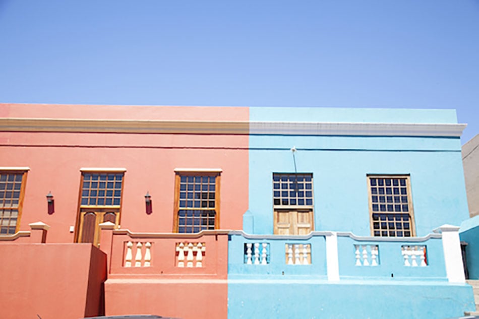
Hooray is a true orange. On Plascon’s colour chart, it sits closer to red than yellow, which means it has more red in it to give the colour its retro neon pastel appeal. Related to the deeper shade, Tangerine Tango (O3-A1-1), Hooray is still considered to have a bright chroma.
How to use Hooray in your space
Use Hooray’s analogous or related colours on either side of the colour wheel to create a dynamic colour combo that is fresh, inviting, contemporary and super energetic. Complementary colours would be blues like Monet Magic (B3-A1-1) or Blue for You (B3-A1-3). Match them up and, yikes, we have a brave and bold combo.
Hooray’s adjacent colours, would be a yellow like Summer Memory (Y2-A1-3) or a purply red like Valentine Rose (R2-A1-2). Put them together and we have another daring combination that will put a spring in your step and some pep to your day.
Kerstin says, “You can also take it back to basics by pairing Hooray up against a white or a soft clean grey backdrop to create a soothing yet energizing statement in a bedroom, lounge or dining area.” And in keeping with serenity, subtly mix touches of Hooray with dusty pink and soft steely blues for a calm but contemporary look.
Kerstin concludes, “Hooray is the kind of colour that, to a lesser degree, shares red’s energising appeal by adding exciting energy to a space or design. This colour is far from shy whether it’s used sparingly or without restraint. So, take the plunge and renergise your space with exciting Hooray!”
![]()
![]()
![]()
![]()
 For more visit Plascon.


You might also like...
-
Building Lean Muscle with Technogym: The Science and Methodology

The pursuit of building lean muscle has maintained the attention of bodybuilders and fitness enthusiasts for decades. Yet, achieving optimal muscle growth goes beyond lifting weight, and ...
-
Perfect Hideaway: nature-based escape

Offering a secluded, nature-based escape, Pinebeach in the quaint little village of Noordhoek, just outside of Cape Town, is a truly charming property. Accessible ...
-
Cheers to a Bright and Inspiring New Year

As the year comes to a close, we feel very grateful for the year that has passed, and equally excited for all the opportunities ...
-
Best Places to Retire in Italy for UK Expats

Dreaming of a life filled with sun-soaked landscapes, delectable cuisine, and the charm of a slower pace? Retiring to Italy offers all this and ...


Visit SA Decor & Design on social media


